

Industrial & Interaction Design Thesis Project

This year-long thesis project explores the reality many women face when seeking gynecological care. It's a dreaded experience, one that many avoid entirely. Why? Because it's often overly clinical, intimidating, and awkward. Yet, reproductive healthcare is essential for everyone with a vagina. Routine exams save lives, yet 3 in 4 women skip their appointments, held back by fear, anxiety, and discomfort.
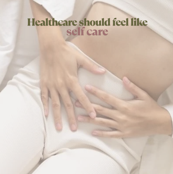
I redesigned the gynecological experience by enhancing patient autonomy, building confidence, and creating a more comfortable environment. This thesis envisions a future where patients no longer fear or avoid their appointments but instead feel empowered. Soleil combines spatial, experience, and industrial design to set a new standard for gynecological care.
Soleil is the future of gynecological care - and it's bright.
September 2024 - May 2025


A Look Into My Process
It started with research.
This project was deeply personal from the start. I was 22 and absolutely terrified to go to the gynecologist. I had put it off for years because of fear. When it came time to choose a thesis topic, I knew I wanted to focus on something important, something that could make a real difference. I’ve always been drawn to the healthcare space, and women’s health felt like the right direction.
As I began researching, I quickly learned I wasn’t alone. In fact, nearly half of all women avoid going to the gynecologist. I needed to understand why. I spoke to professionals, interviewed doctors, and sent out surveys that collected responses from women across different generations. I explored every angle: Should I reinvent the tools? Create a new procedure?
And then it hit me, it wasn’t about the tools. It was the experience.
That’s where I could make the biggest impact. If I could improve the physical space, patients would feel more at ease. Like they were walking into an oasis, not a sterile office. If I could redesign the check-in process and facilitate better doctor-patient interactions, patients would feel supported instead of dismissed. And if I could reimagine the exam chair, they’d feel empowered in a moment that often feels anything but.
That was the spark. That’s how Soleil was born.


I spoke to real people.
“How do you feel at the gynecologist?"
I conducted three studies reaching over 100 individuals who require women’s healthcare. Here’s a look at some of their responses when asked to describe their experience.
Drew from my own experience.
I finally did it, I went to the gynecologist. After years of fear and hesitation, this project gave me the motivation and confidence to face that anxiety head-on and truly understand the experience I was trying to redesign.


Found the problem.
According to a study in The National Institute of Mental Health, 64% of women report experiencing fear, 55% experience anxiety, and 52% experience discomfort.
Routine exams save lives through early detection. Most reproductive cancers like cervical cancer have a survival rate of 91% if diagnosed early. However, despite knowing the benefits, half of all women of reproductive age do not visit the gynecologist. Feelings like “gynecology anxiety" prohibit people from seeking the care they need.
I began asking within women's reproductive healthcare, how can the gynecological experience be redesigned to reduce anxiety, humanize the often-dreaded experience, and make more women visit the gynecologist?
Defined my focus.
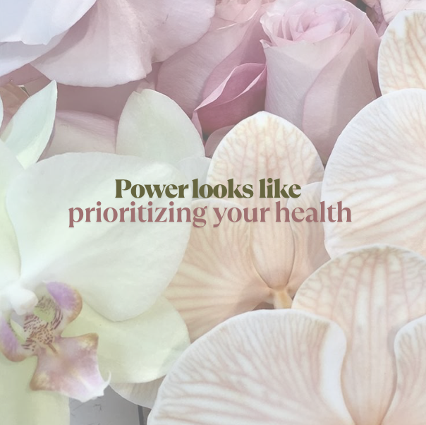
My ultimate goal was to transform the experience in order to encourage more women take control of their health. I learned the benefits of visiting the gynecologist, yet I understood why people were avoiding it.
By addressing the root causes of fear and discomfort, we can get women to actually visit the gynecologist. I will reimagine the experience to feel less anxiety-inducing and more dignifying, to create a space where patients feel safe, supported, and empowered to show up for their health.

Created user personas.
To ensure the design addressed a wide range of needs, I created four user personas that guided my process: a nervous new patient, a hopeful mother navigating fertility, a transgender man concerned about feeling excluded, and an experienced patient skeptical of change. These personas helped me stay grounded in real, diverse experiences throughout the entire project.


Strategized a plan.
For this project, I chose to utilize three aspects of design to improve gynelogical care. Each working together to create a more supportive, dignified, and empowering gynecological experience.
1. Spatial Design = Conceptualize floor plans, design the exterior, and guide the interior aesthetics.
2. Experience Design = Improving the patient experience from the check-in process to the exam.
3. Industrial Design = Redesigning the exam chair to reduce anxiety and empower the patient.


Then I made models, mockups & prototypes.
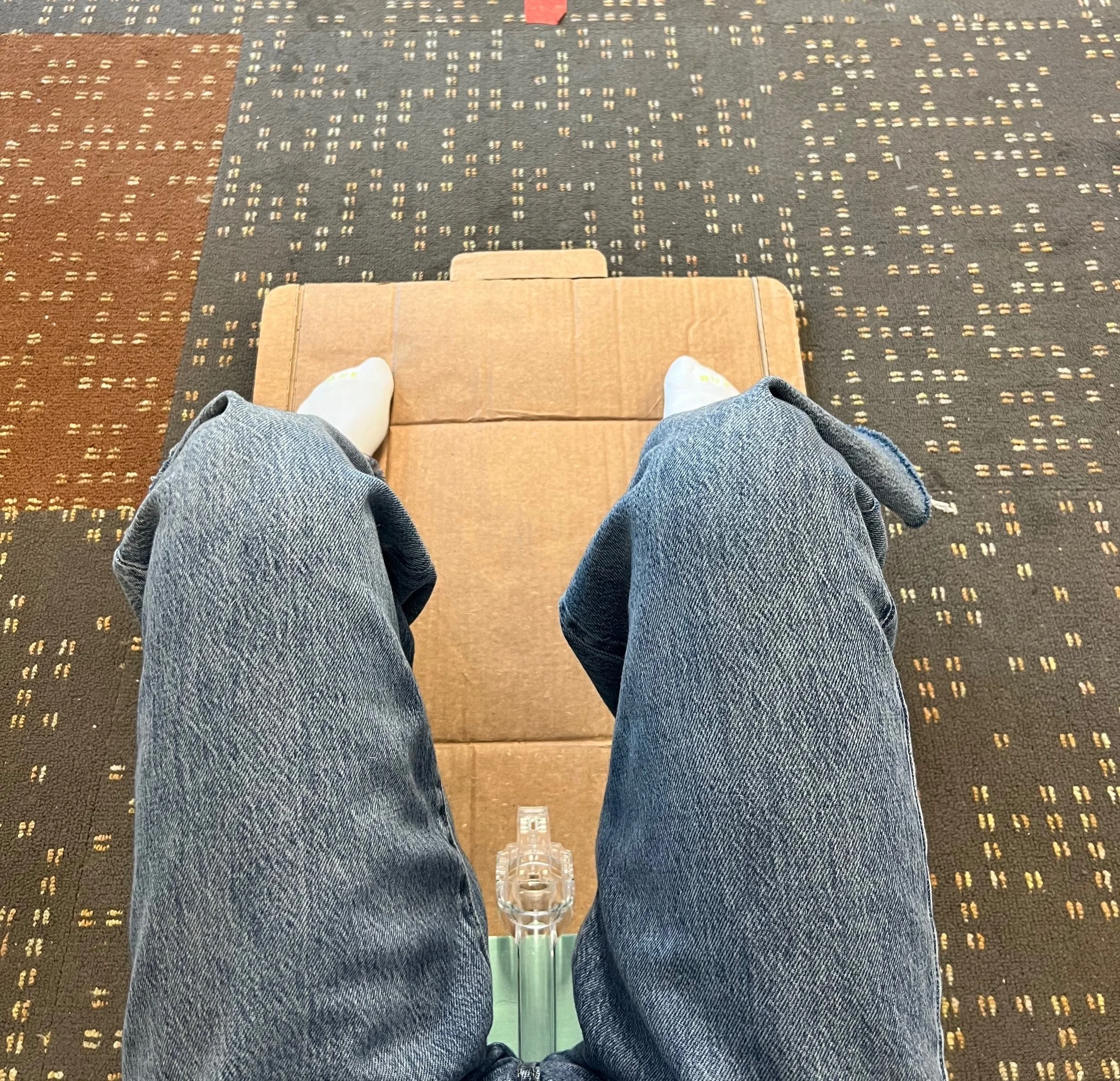
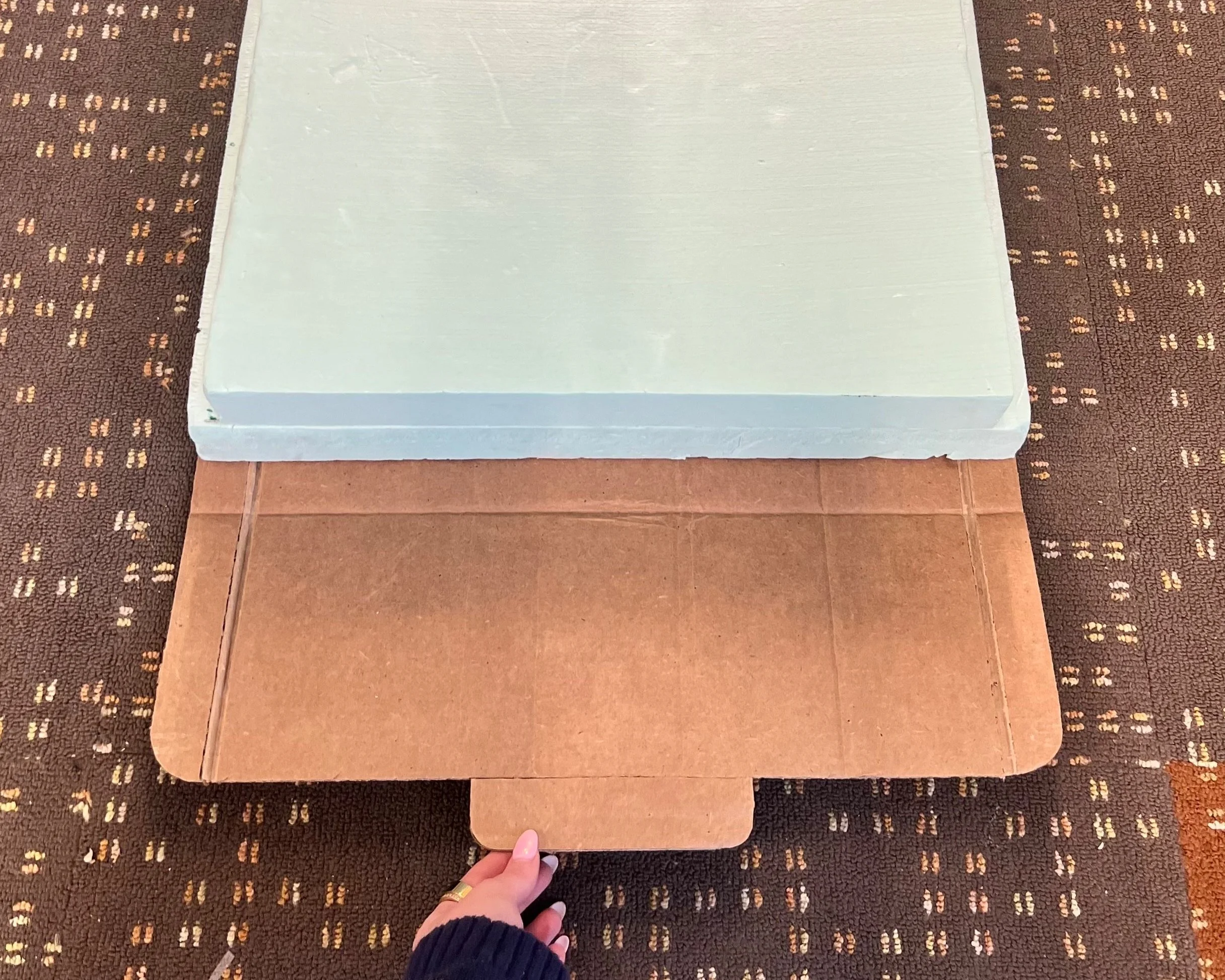
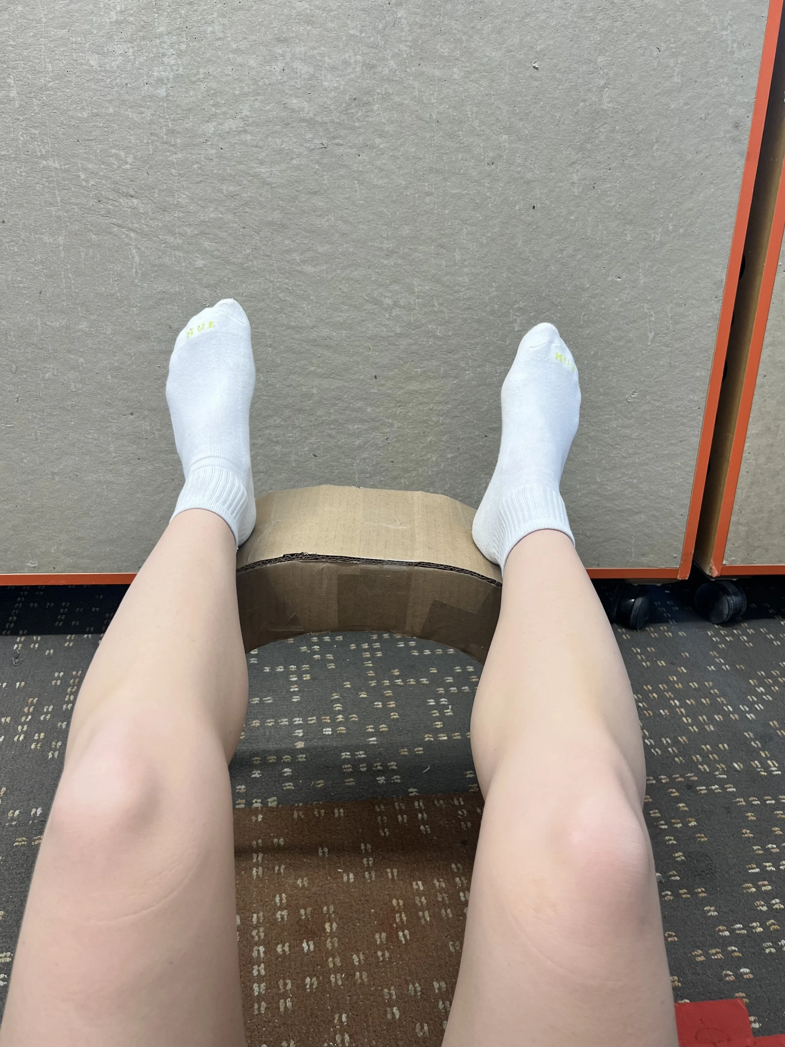
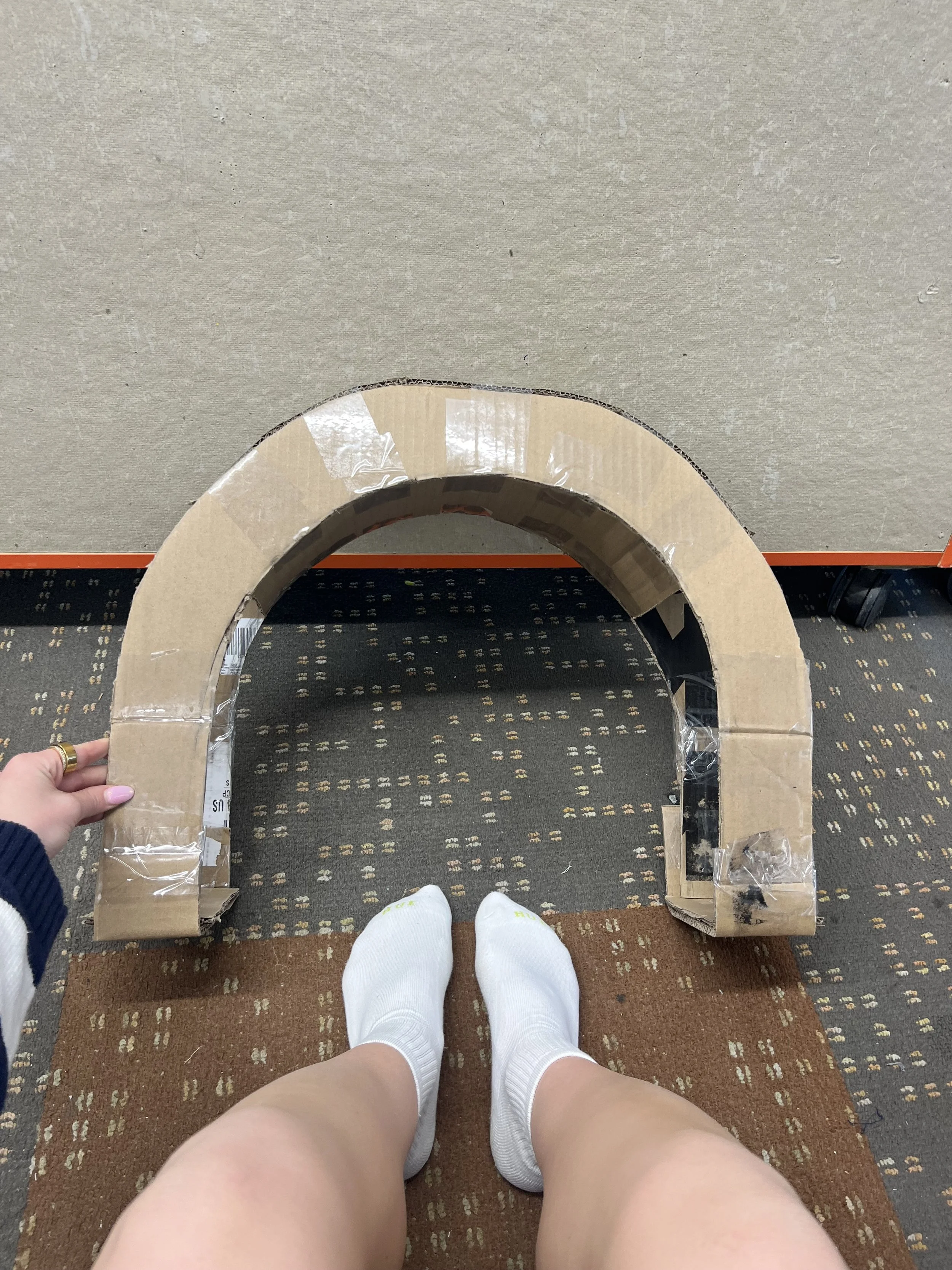
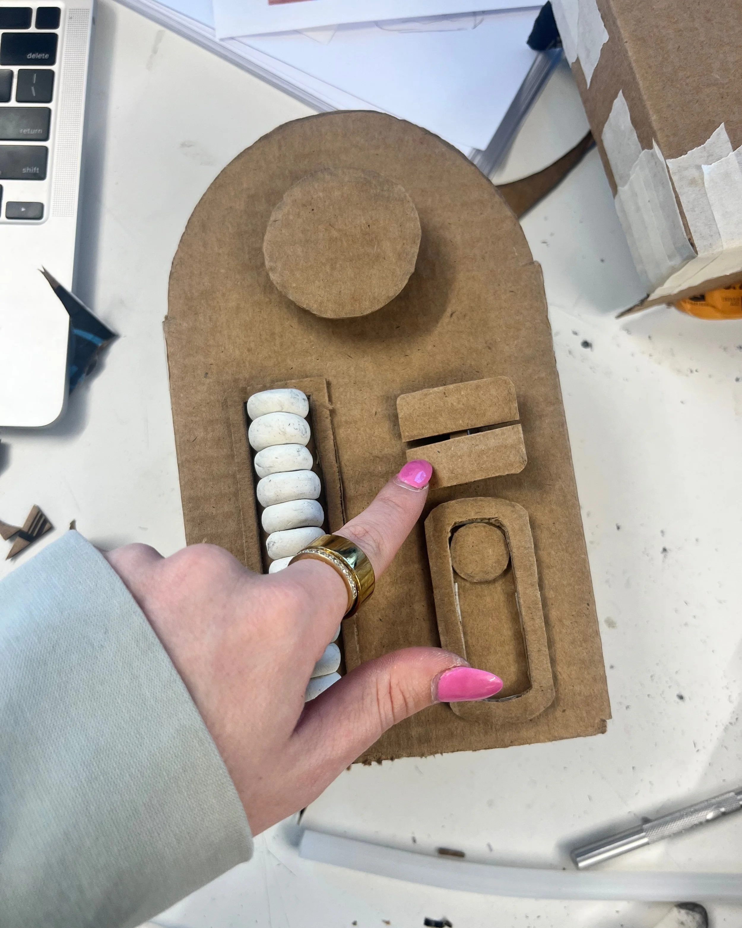
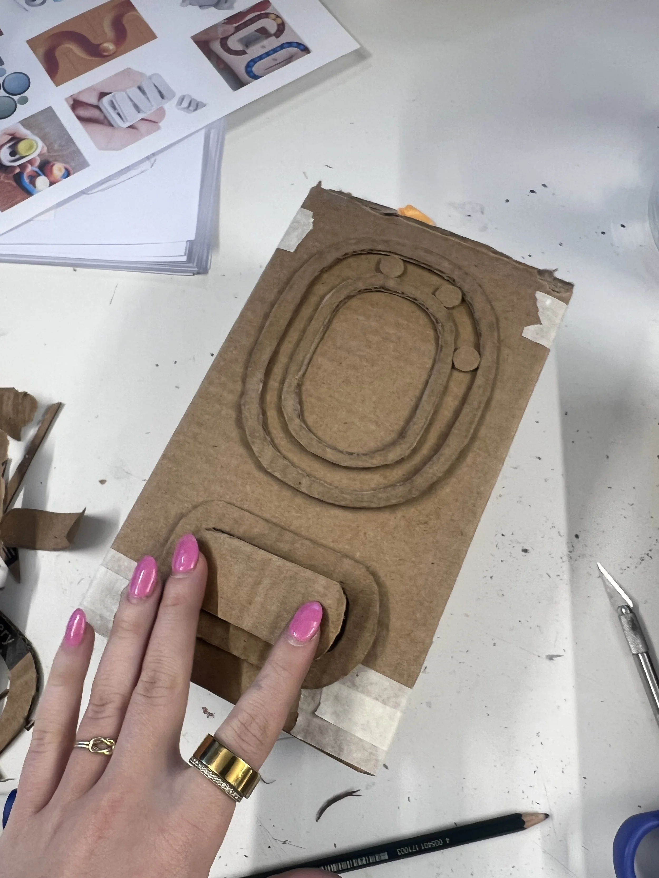
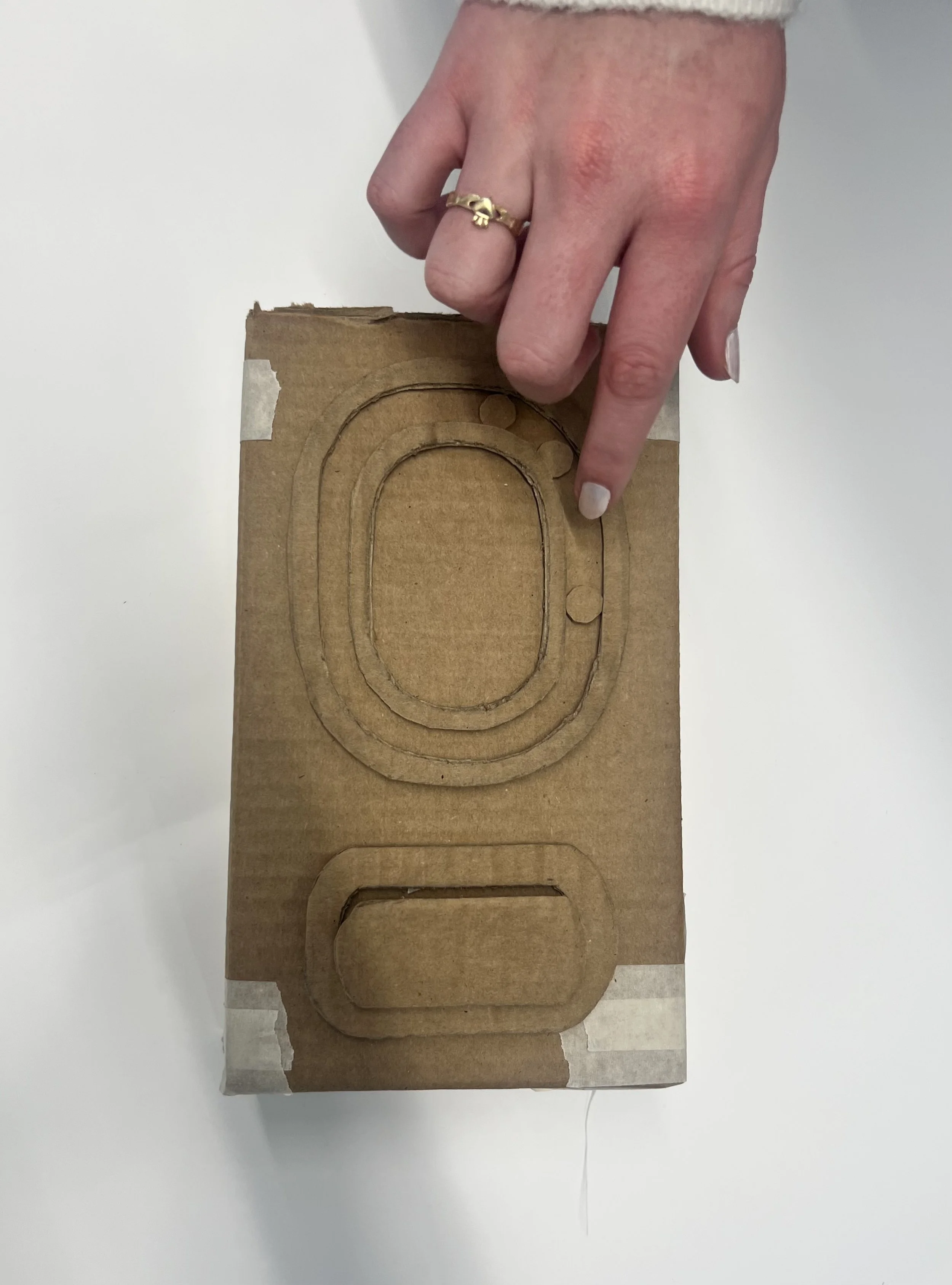
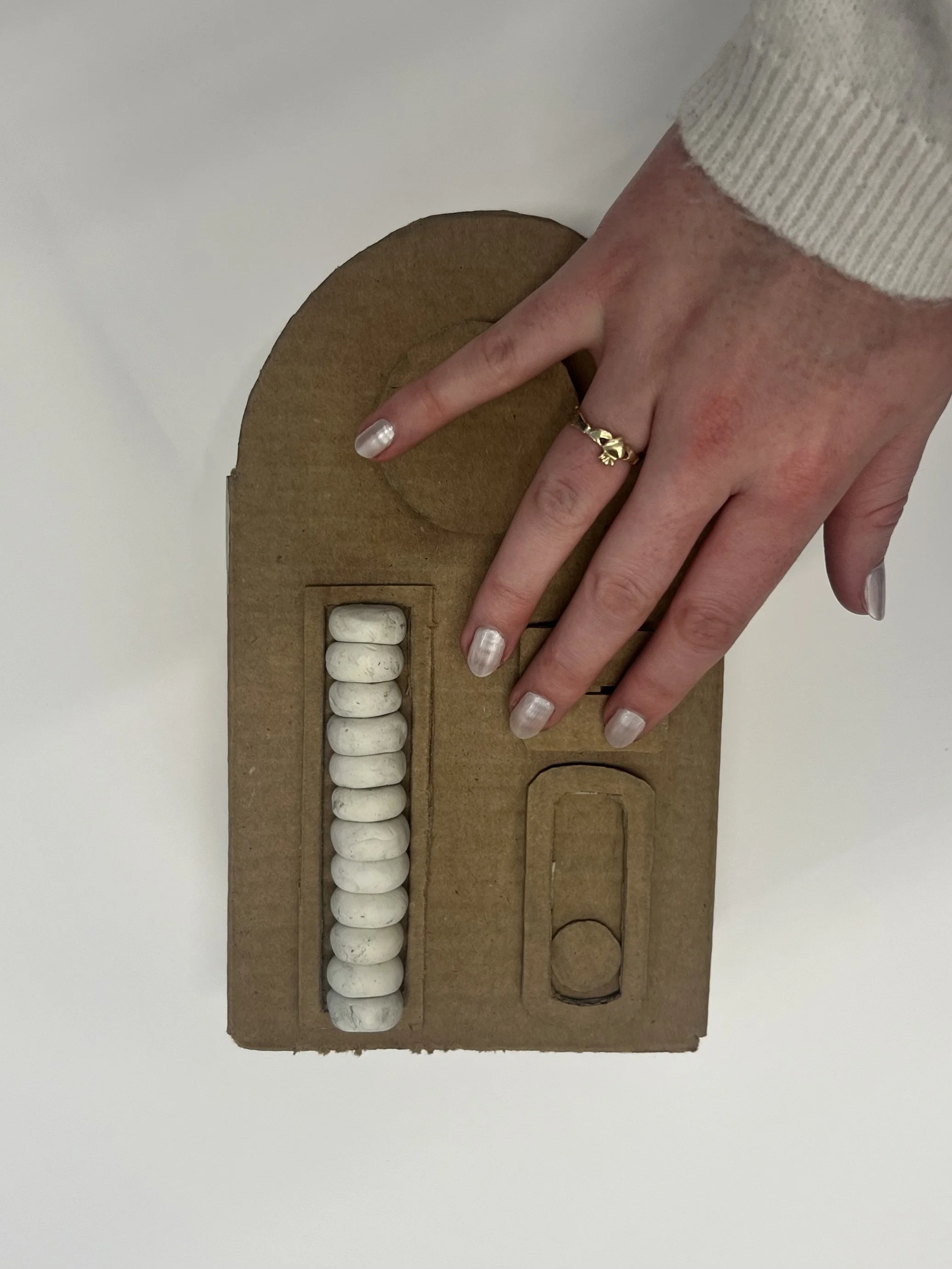
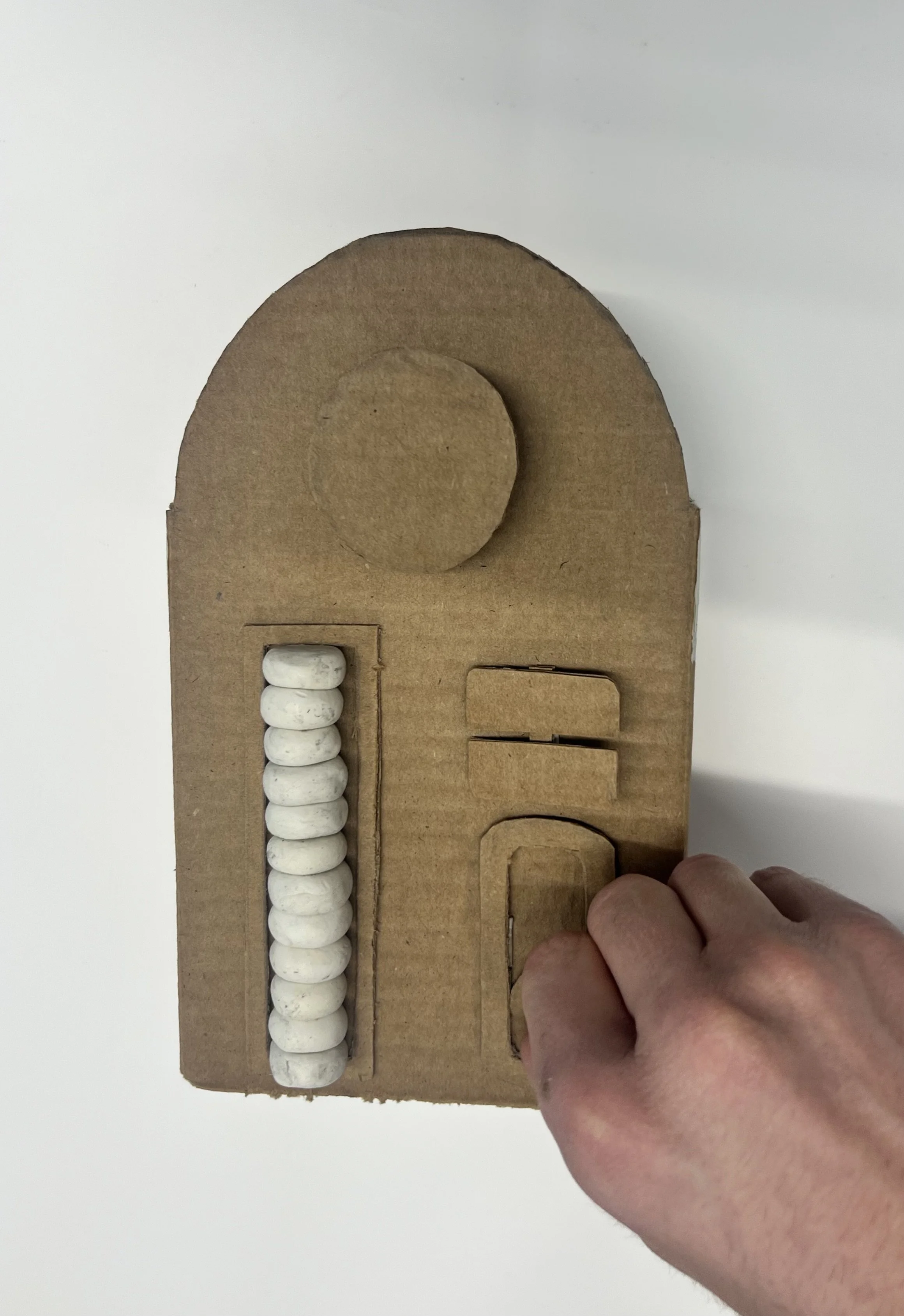
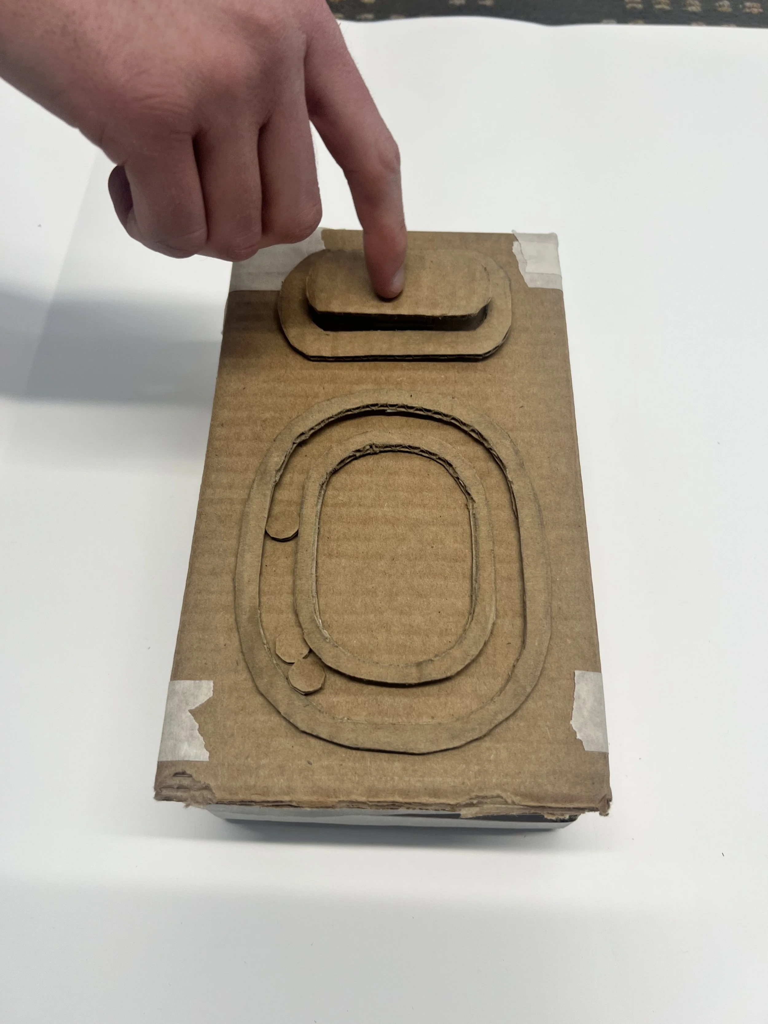
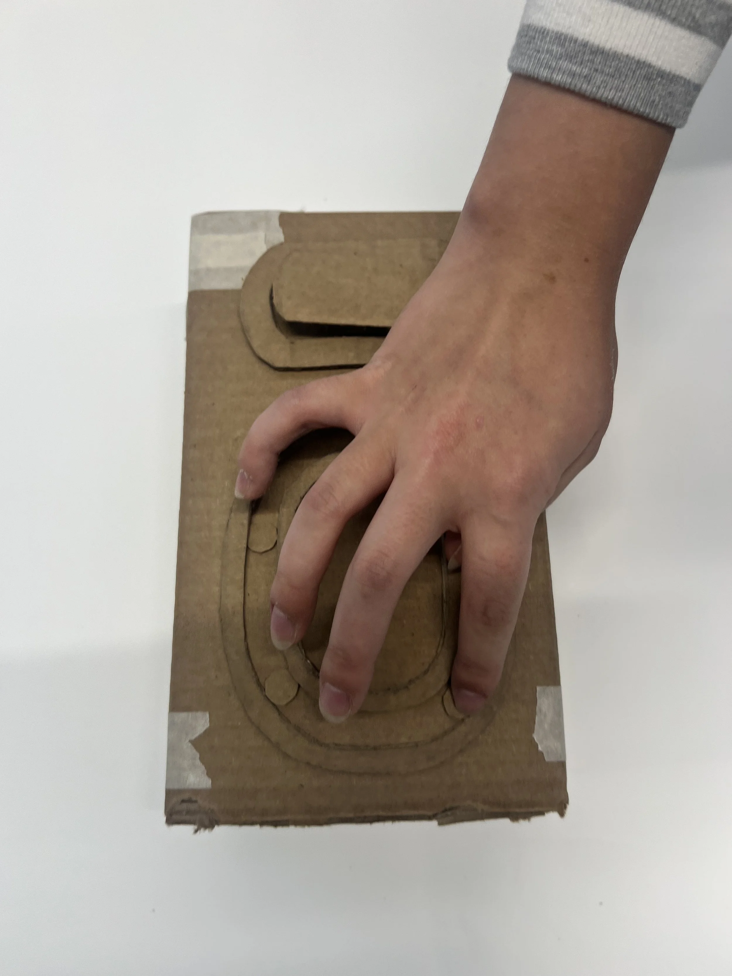
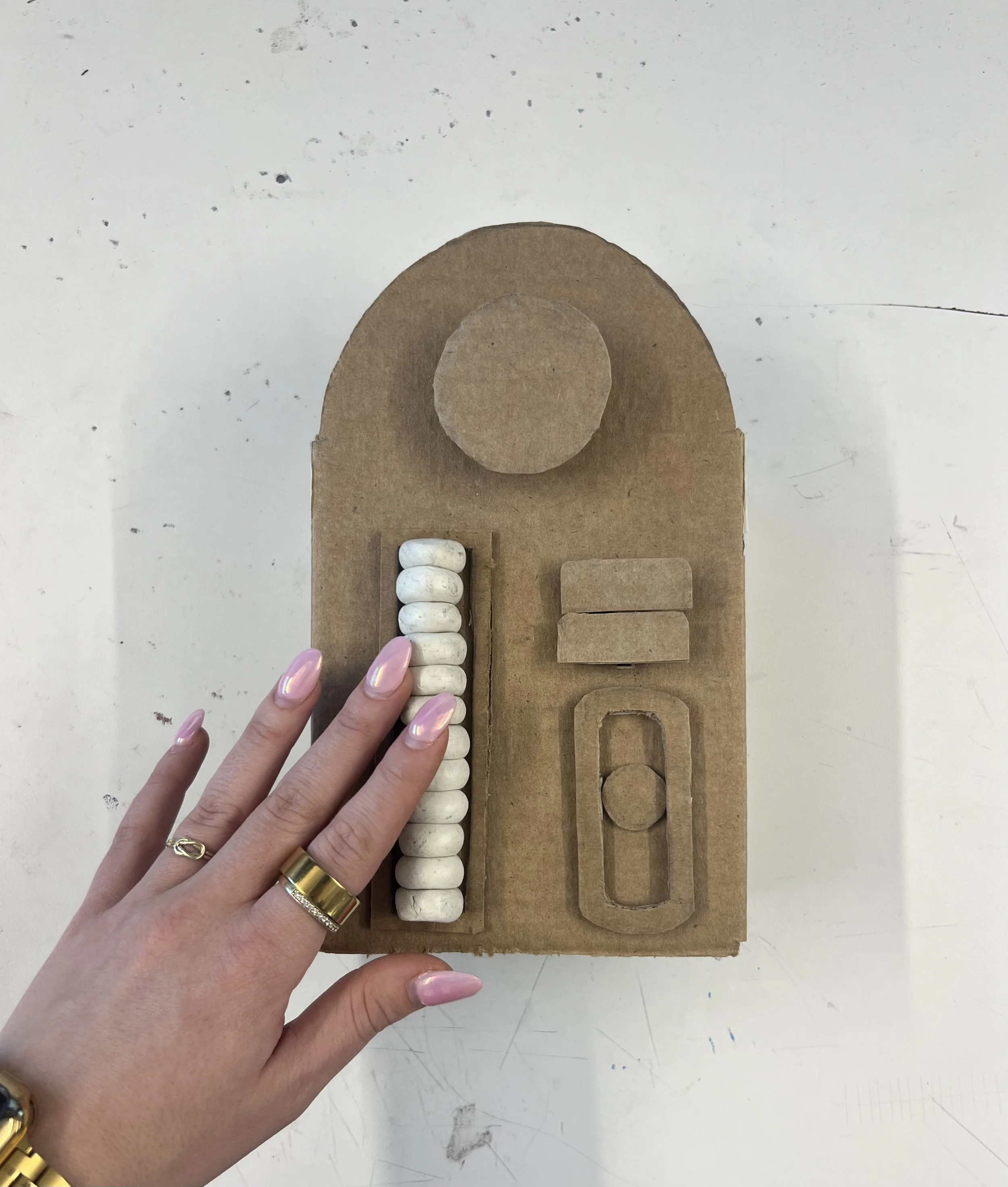
Throughout my development process, I built numerous models, mockups, and prototypes. Using materials like cardboard, paper, and plastacine, I explored form, scale, and functionality. This process allowed me to quickly test and iterate ideas. I created a series of quick, scrappy models to work through different parts of the exam chair, focusing on the seat, stirrups, and armrests.
Got feedback from user testing.
I designed with deep empathy, constantly putting myself in the patient’s shoes to understand what comfort, dignity, and control could truly look like. I tested specific aspects of the chair, like the sensory element embedded in the armrest, by gathering real feedback from users. This helped me learn which types of “fidgets” felt the most calming, distracting, and satisfying during moments of anxiety. Each design decision was shaped by those insights, allowing the final outcome to be both intentional and human-centered.
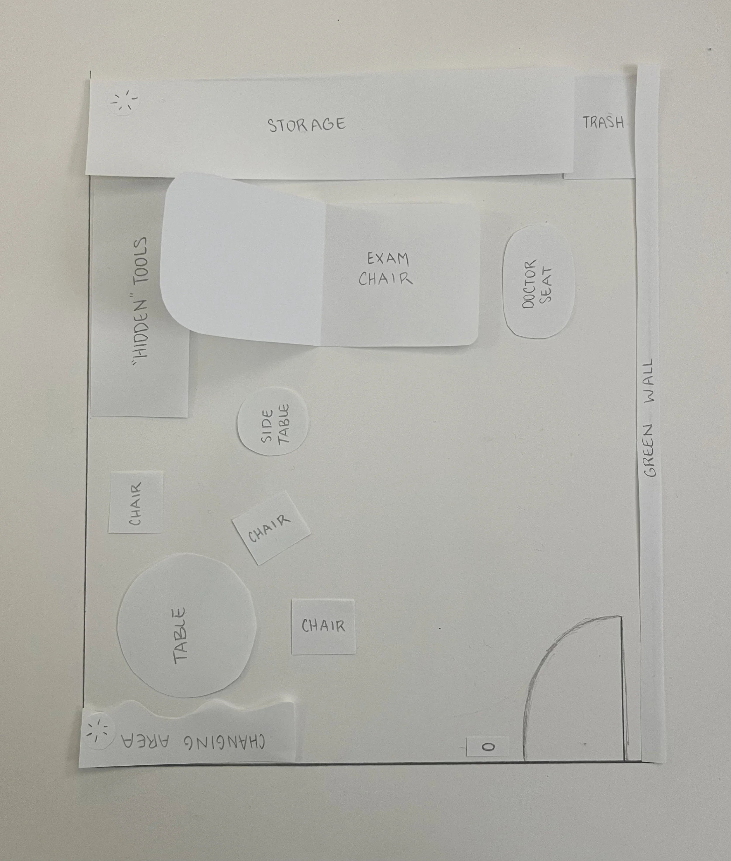
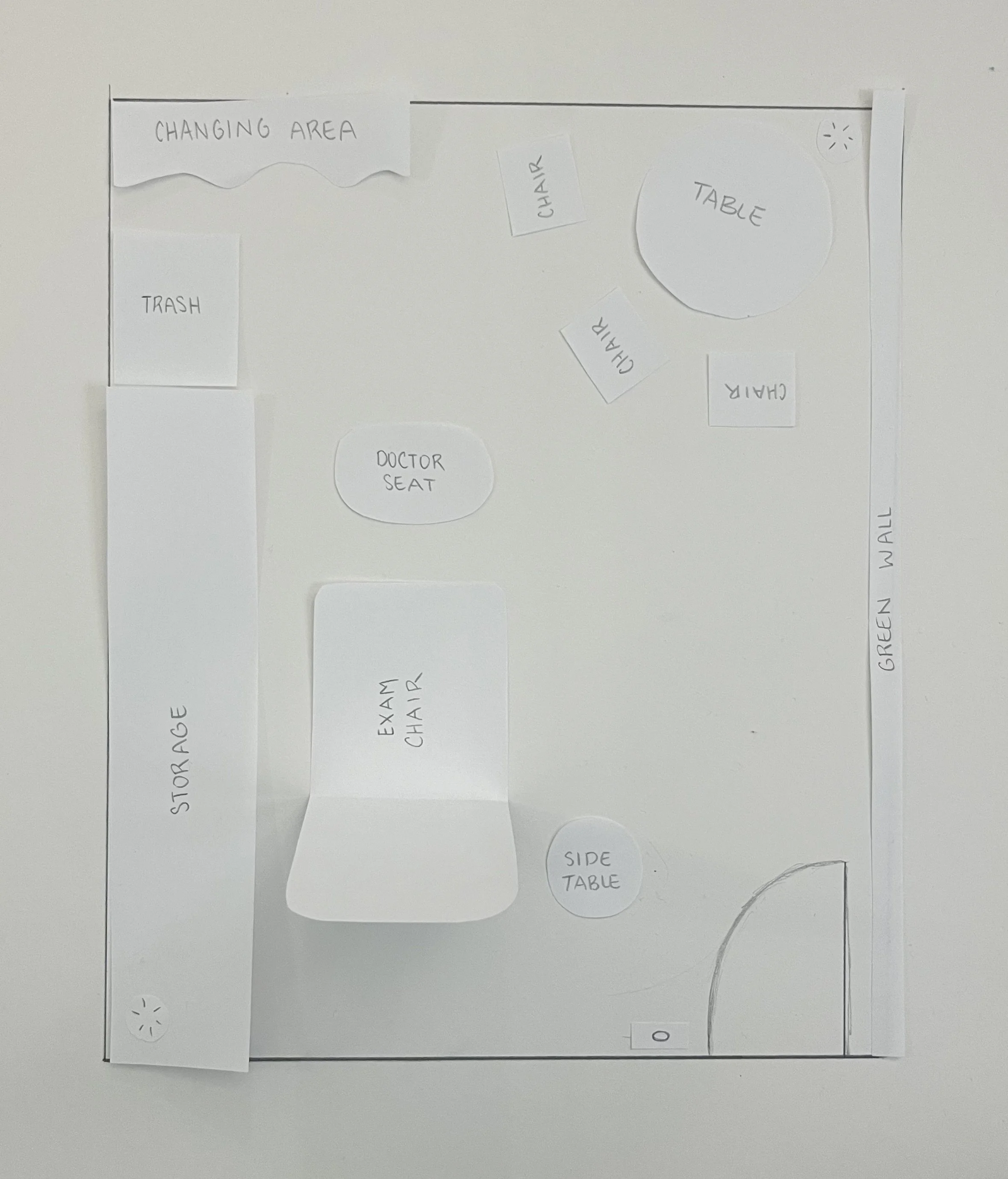
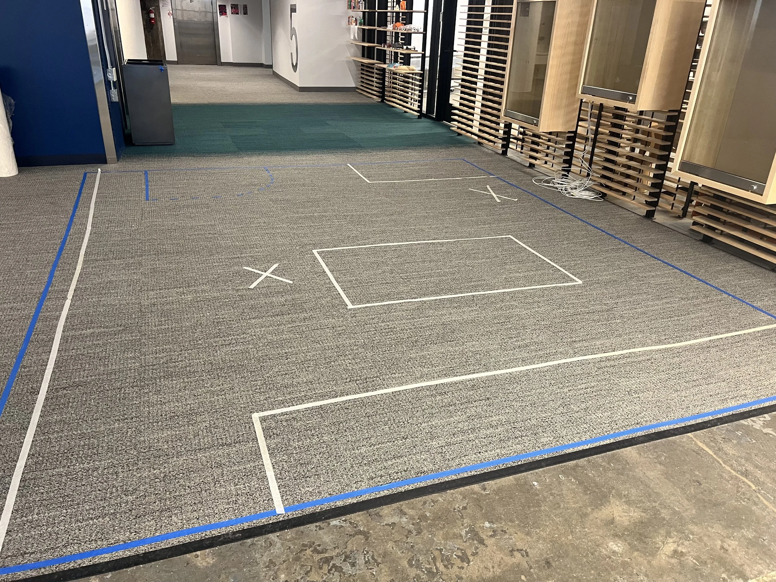
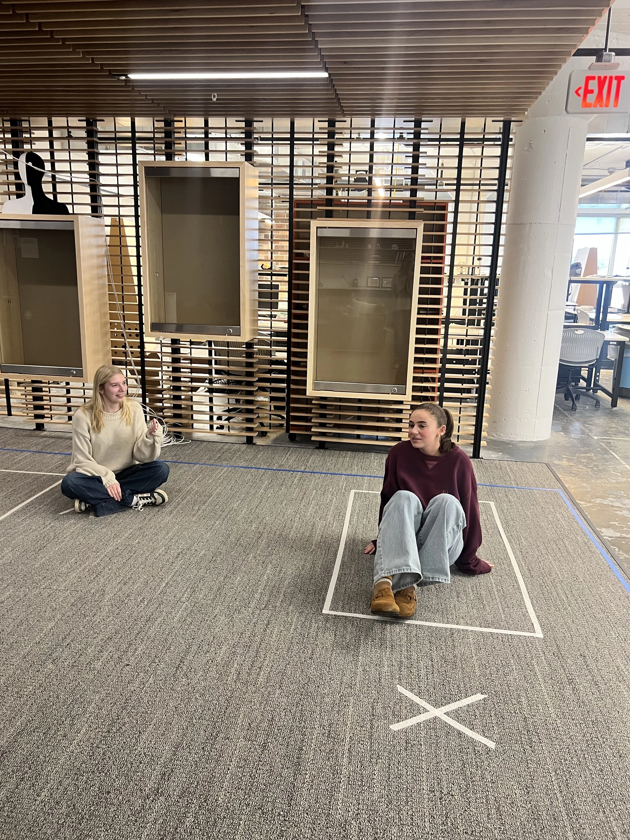
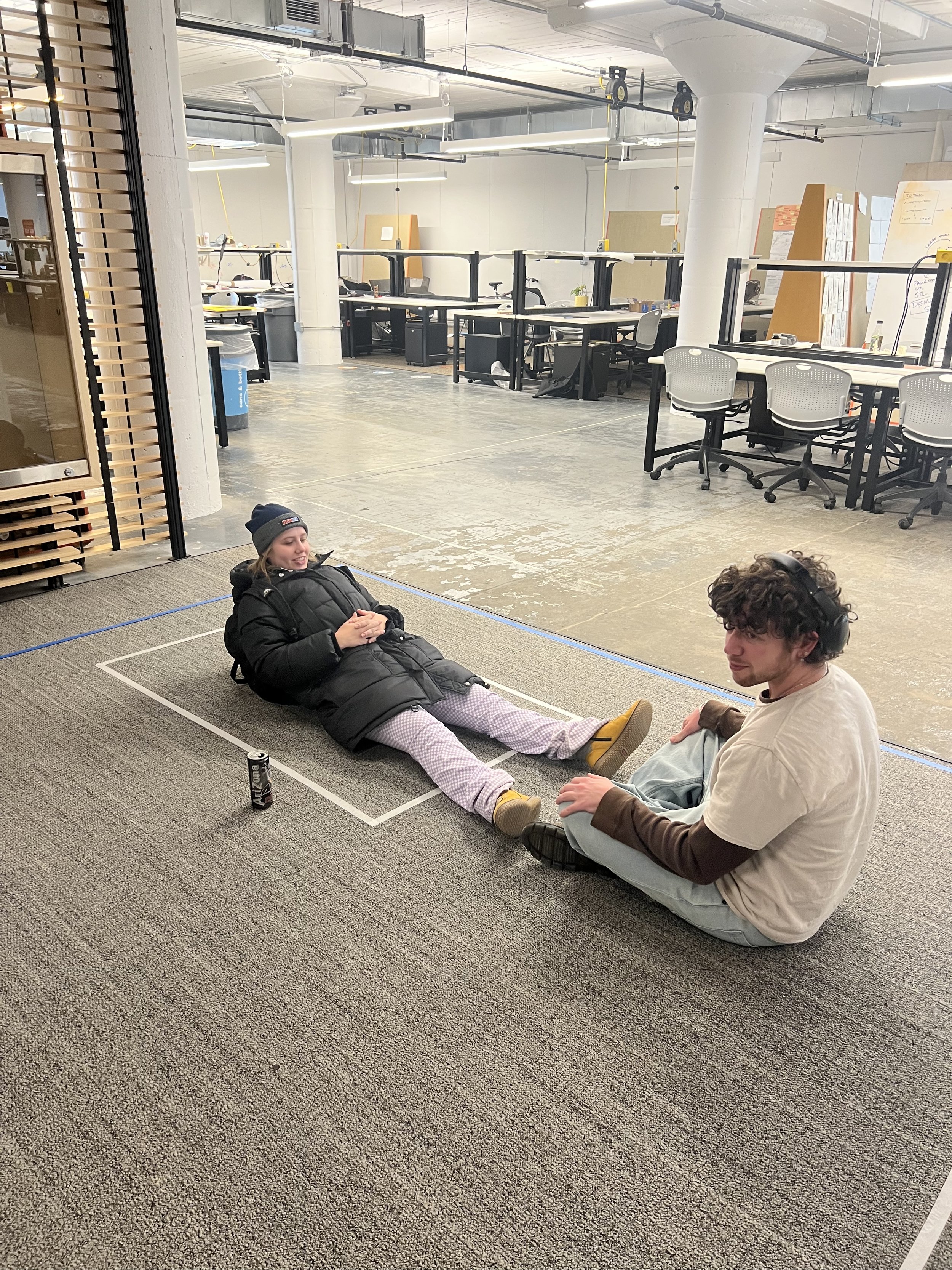
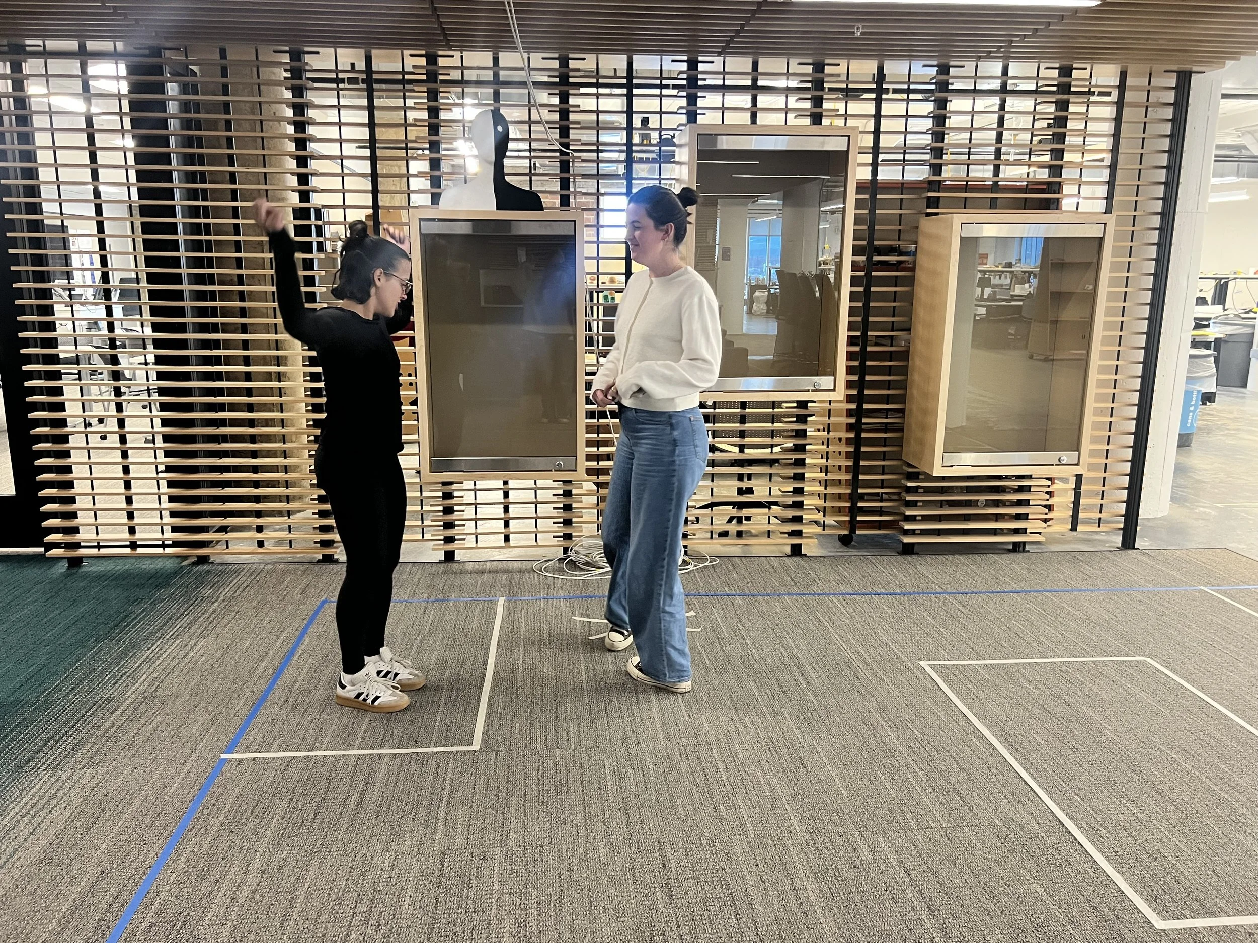
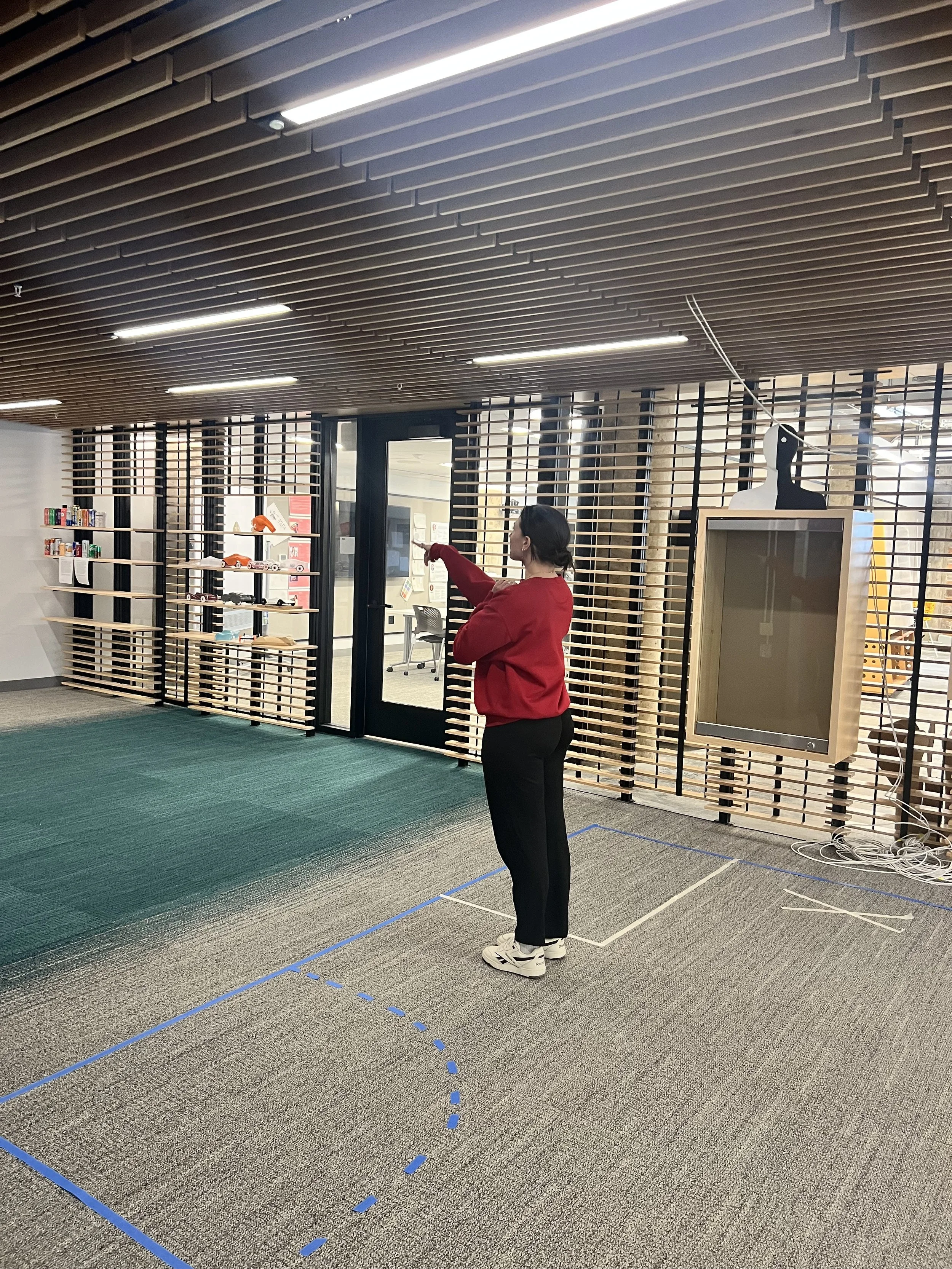
When exploring design decisions for the clinic, I set up mock exam room scenes to test different layouts. I had friends and classmates walk through them to simulate the patient journey. Their feedback helped shape key design decisions.


Developed my concept.
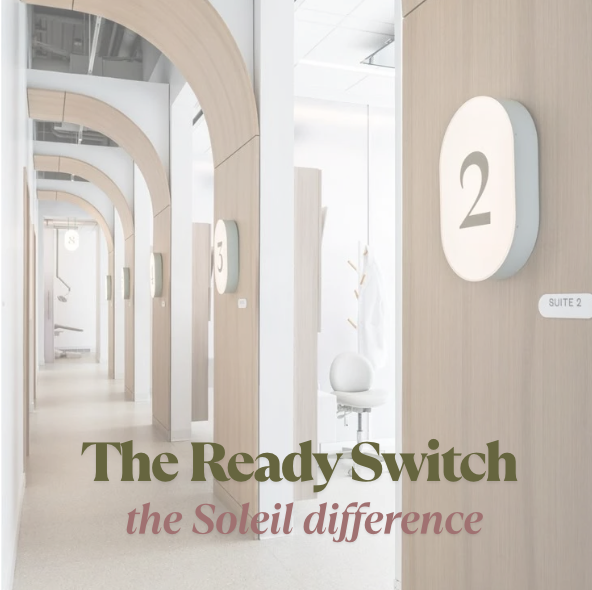
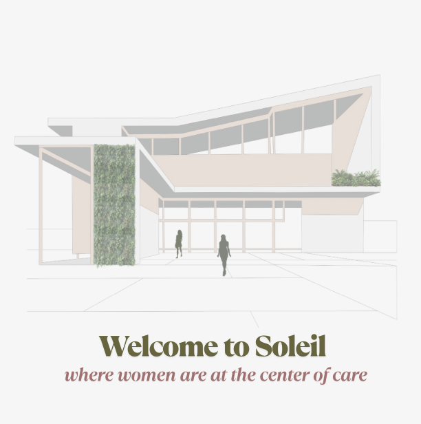
Soleil is the new standard of gynecological care. I am essentially creating a guide of how to build, design, and operate a clinic.
The idea is that this can be a nation wide initiative. This framework can also be used to adapt existing spaces to become a “Soleil Certified” clinic.
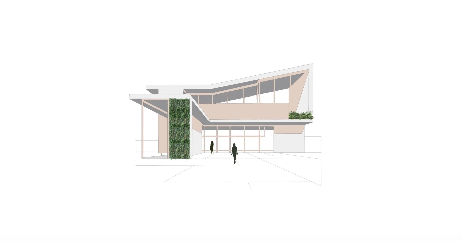
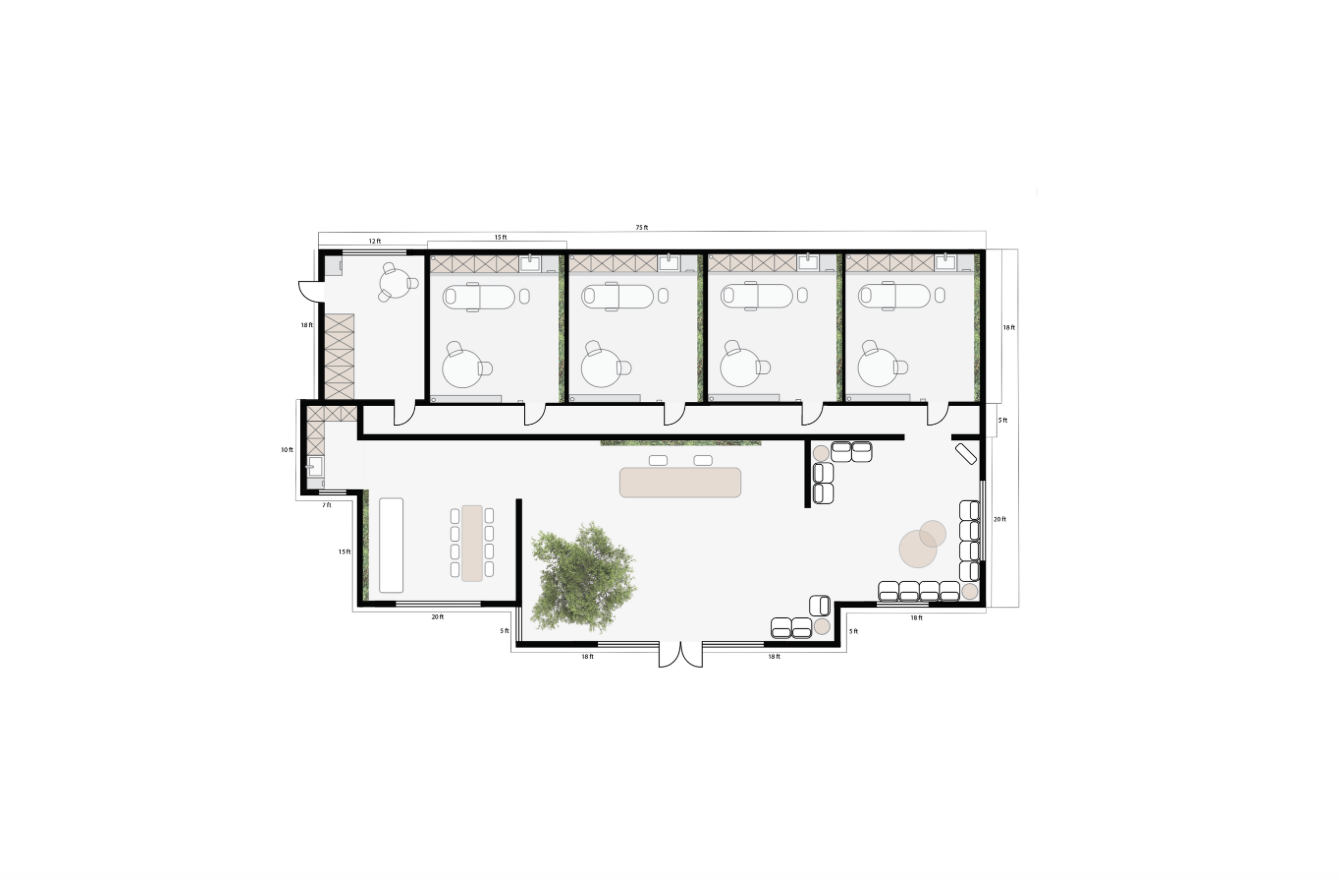
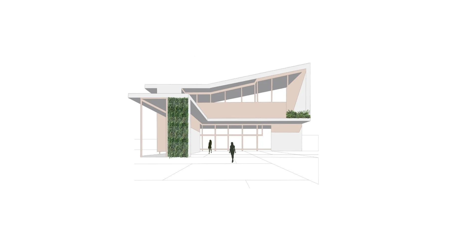
Designed the clinics floorplan.
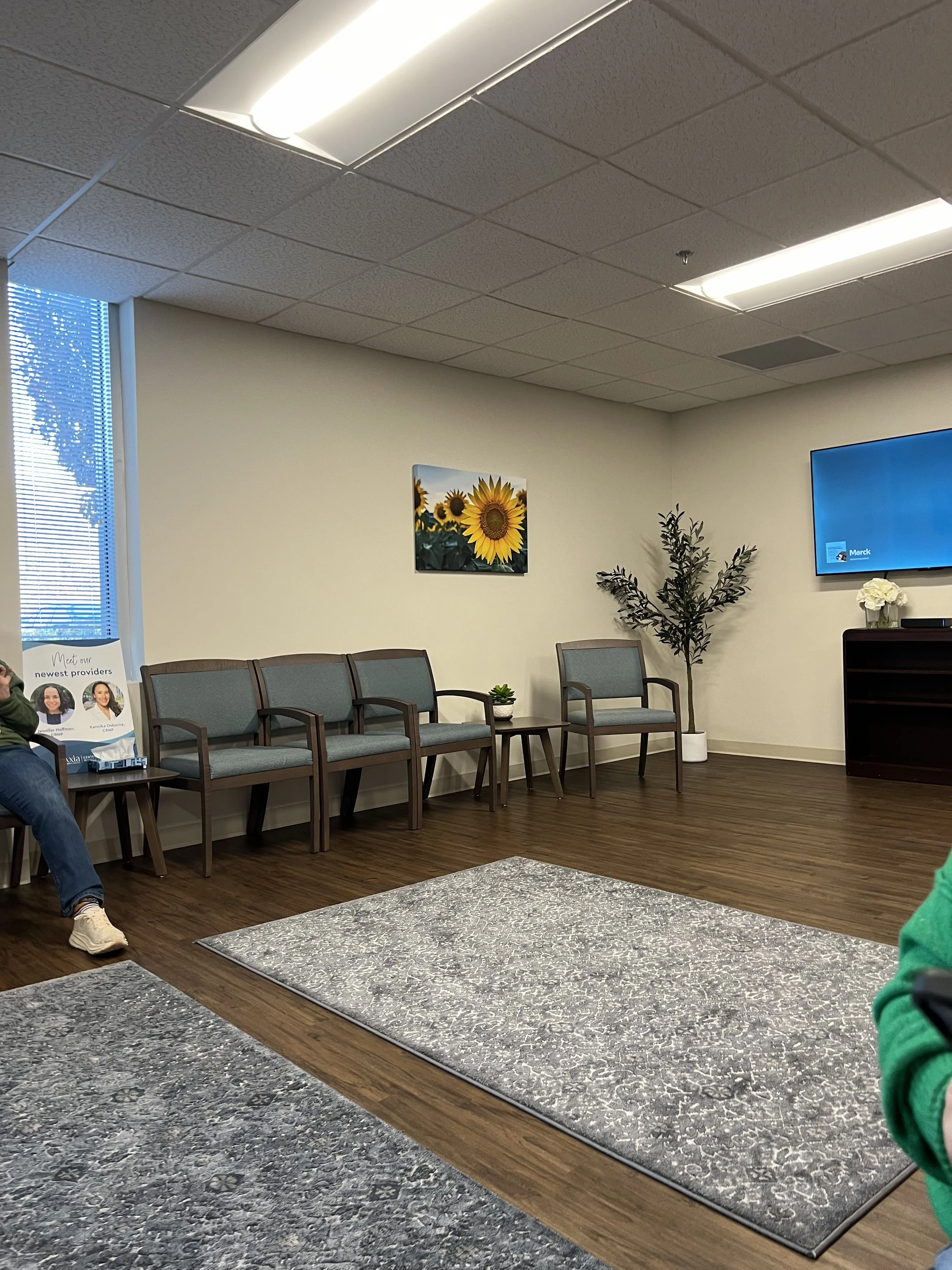
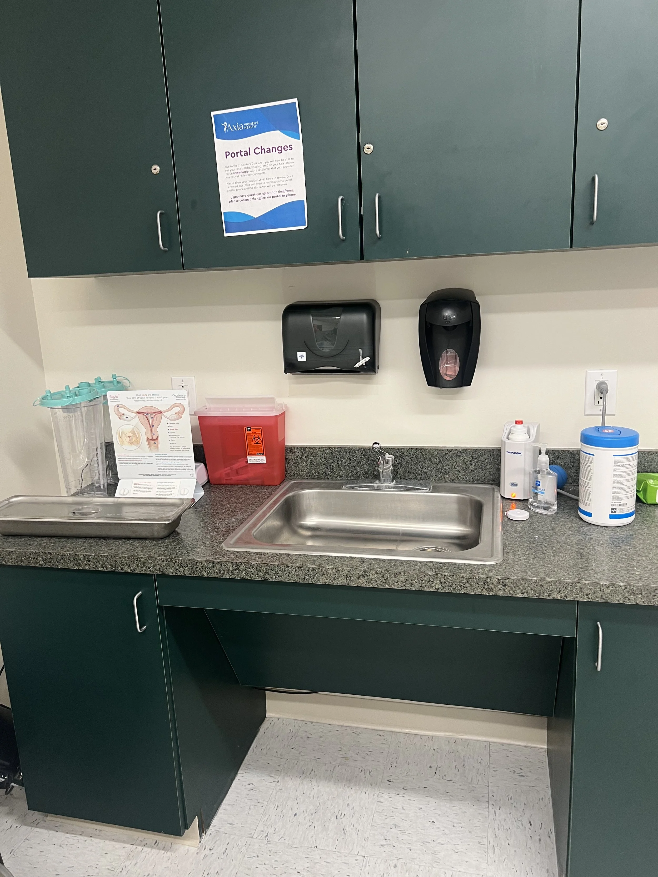
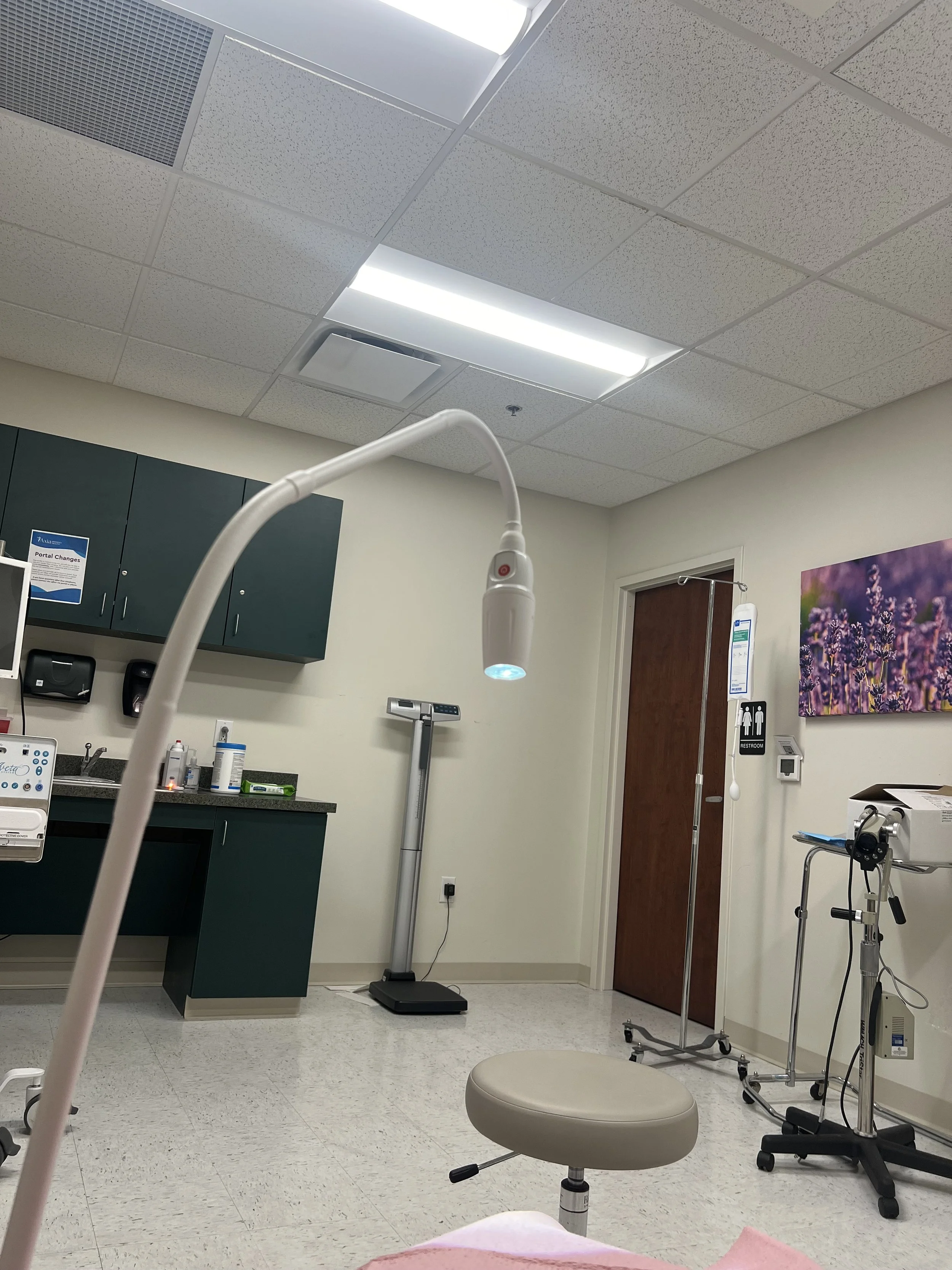
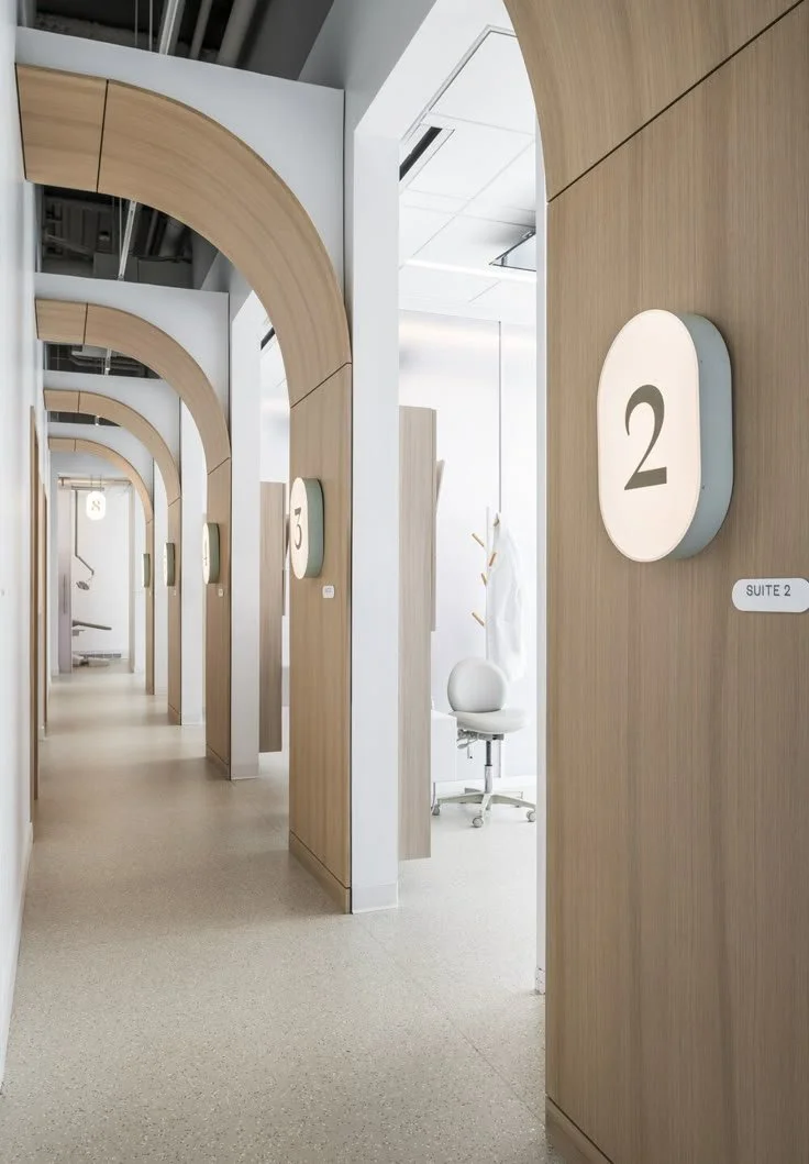
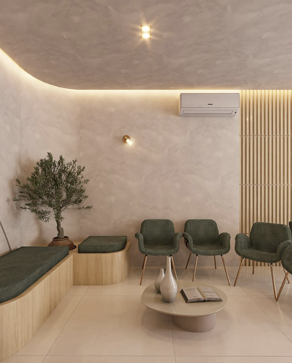
Under the spatial design category, I created the full layout for the clinic, including the exam room, waiting area, and a small café to foster a sense of community. My goal was to make the space feel tranquil and welcoming, moving away from the cold, clinical atmosphere typically associated with medical environments.


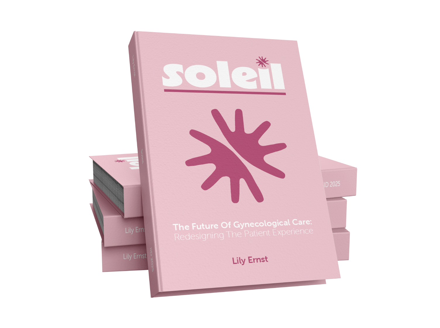
Created Soleil’s branding.
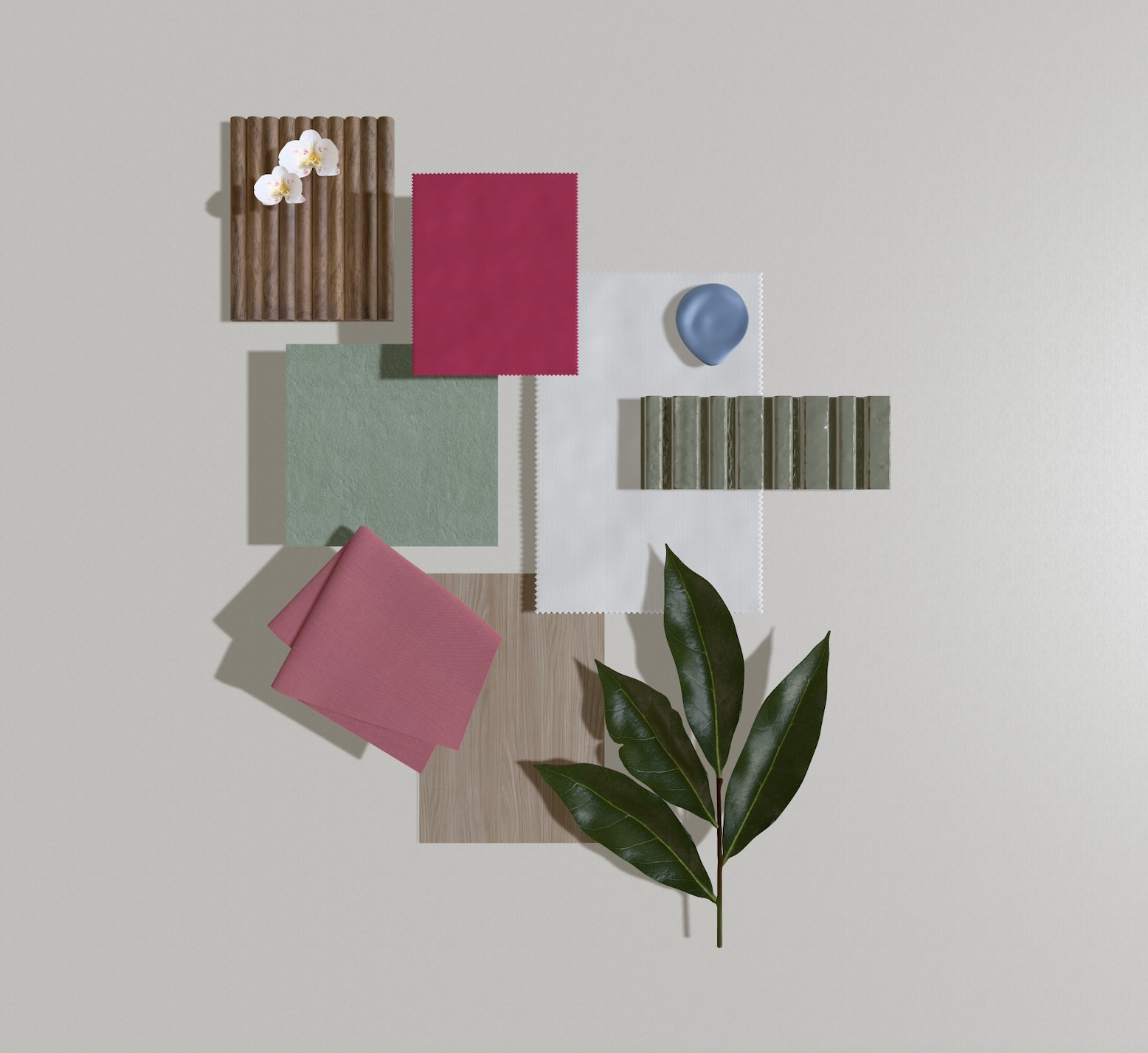
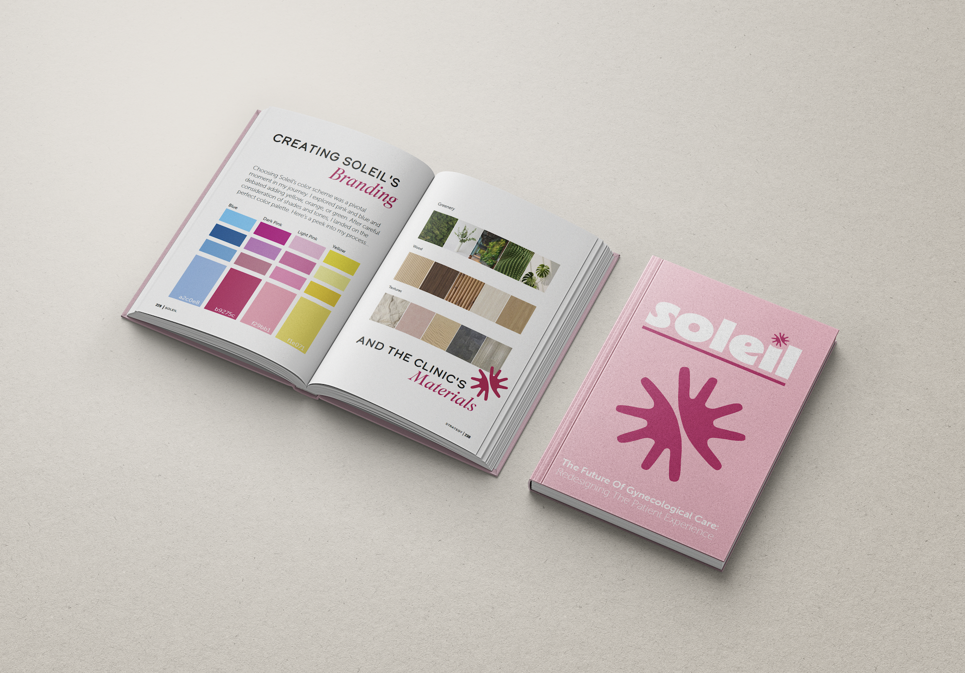
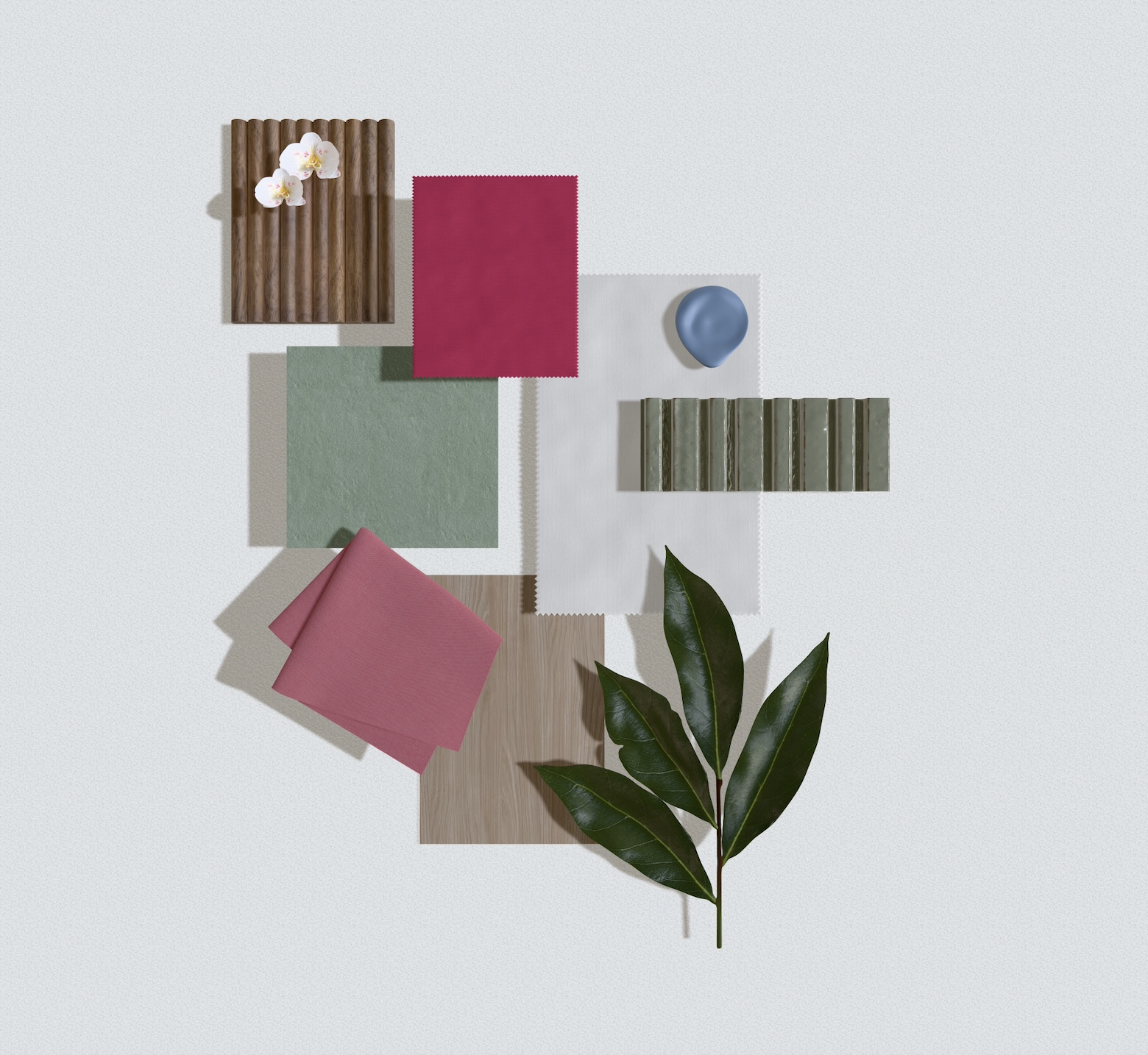
The name Soleil means “sun” in French, a reminder that people who need gynecological care deserve to be at the center. I created a custom logo and visual identity that feels bright, welcoming, and modern. The branding balances cheerful energy with a calming, down-to-earth feel through a warm color palette and approachable design language. It was important that Soleil feel like a place you’d want to go, not a place you dread.
Learned about color theory & bio-design.
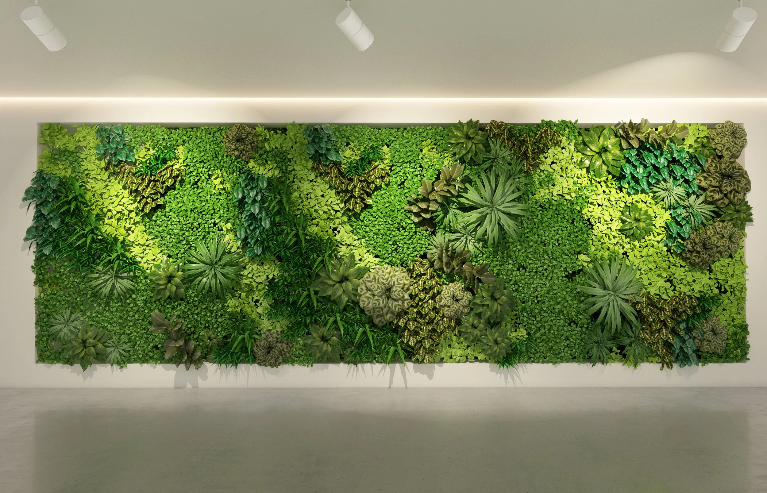
I applied what I’ve learned from color theory to make intentional, soothing choices throughout Soleil’s space and branding, while also exploring materials through the lens of bio-design, using natural properties that offer real health benefits to create a calming, supportive environment.
Unlike the typical clinical, cold atmosphere, Soleil utilizes lots of warm wood, tranquil greenery, and a soft neutral palette.


Explored how I could transform the patient experience.
After speaking with dozens of women, I began to identify key aspects of the patient experience that could be rethought. So much of the feedback centered around anxiety, feeling cold, nervous, sweaty, and overwhelmed before and during the appointment. Many shared frustrations with the impersonal check-in process. Others voiced how uncomfortable it felt to ask their doctor questions or advocate for themselves, and the check-in process felt impersonal. They wished there was something to distract them during procedures, something calming to look at besides the typical sterile art on the walls. Across all responses, there was a common desire for the experience to feel more empowering, something that could make them feel strong and supported in such a vulnerable space.
Focused on touchpoints I could improve.
I focused on key touchpoints throughout the entire visit, from the check-in process, to the environment inside the exam room, to the experience during the exam itself. It was my goal to reduce anxiety, build trust, and make patients feel more comfortable and in control.

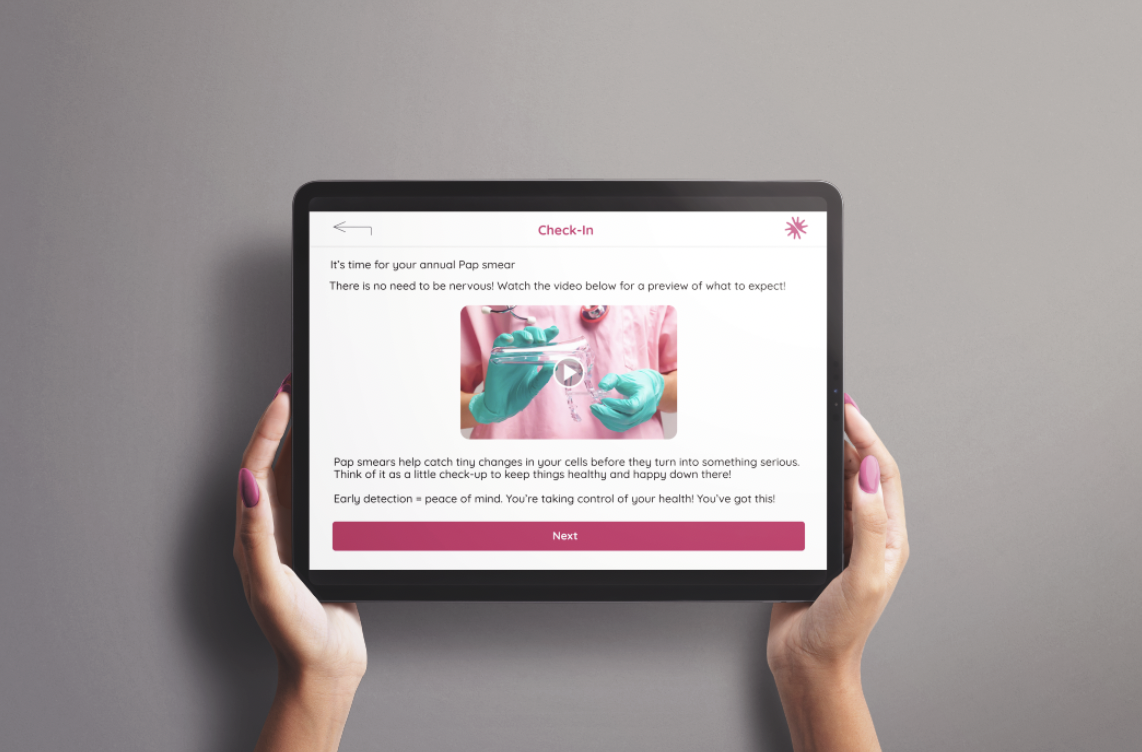
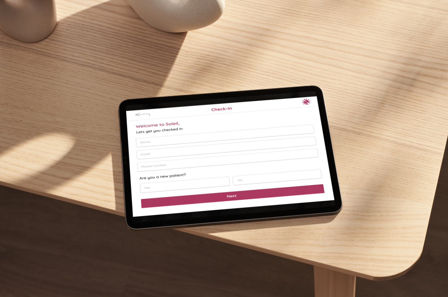
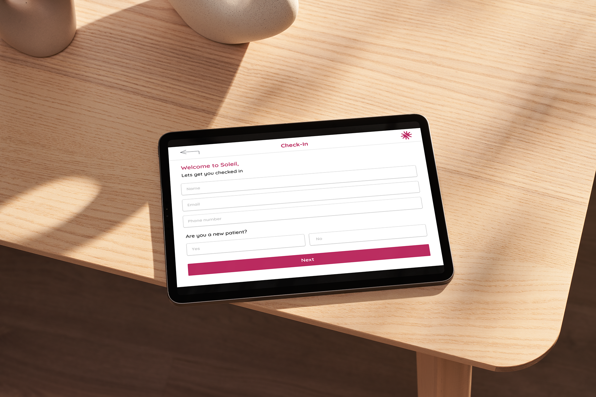
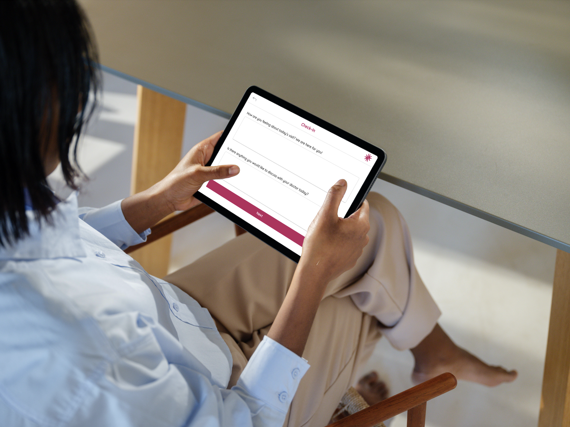
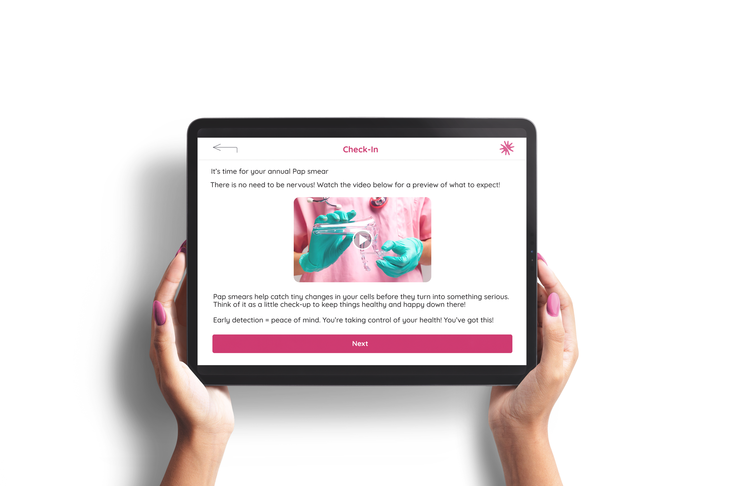
Designed a user interface for the check-in process.
I designed this interface using Figma, to empower the patient while giving the doctor helpful context to provide more thoughtful, informed care. My goal was to enhance the patient experience without disrupting existing workflows. The interface guides patients through a thoughtful check-in process, allowing them to share how they’re feeling, communicate any sensitive concerns or past trauma, and ask questions, all in a private and non-intimidating way.

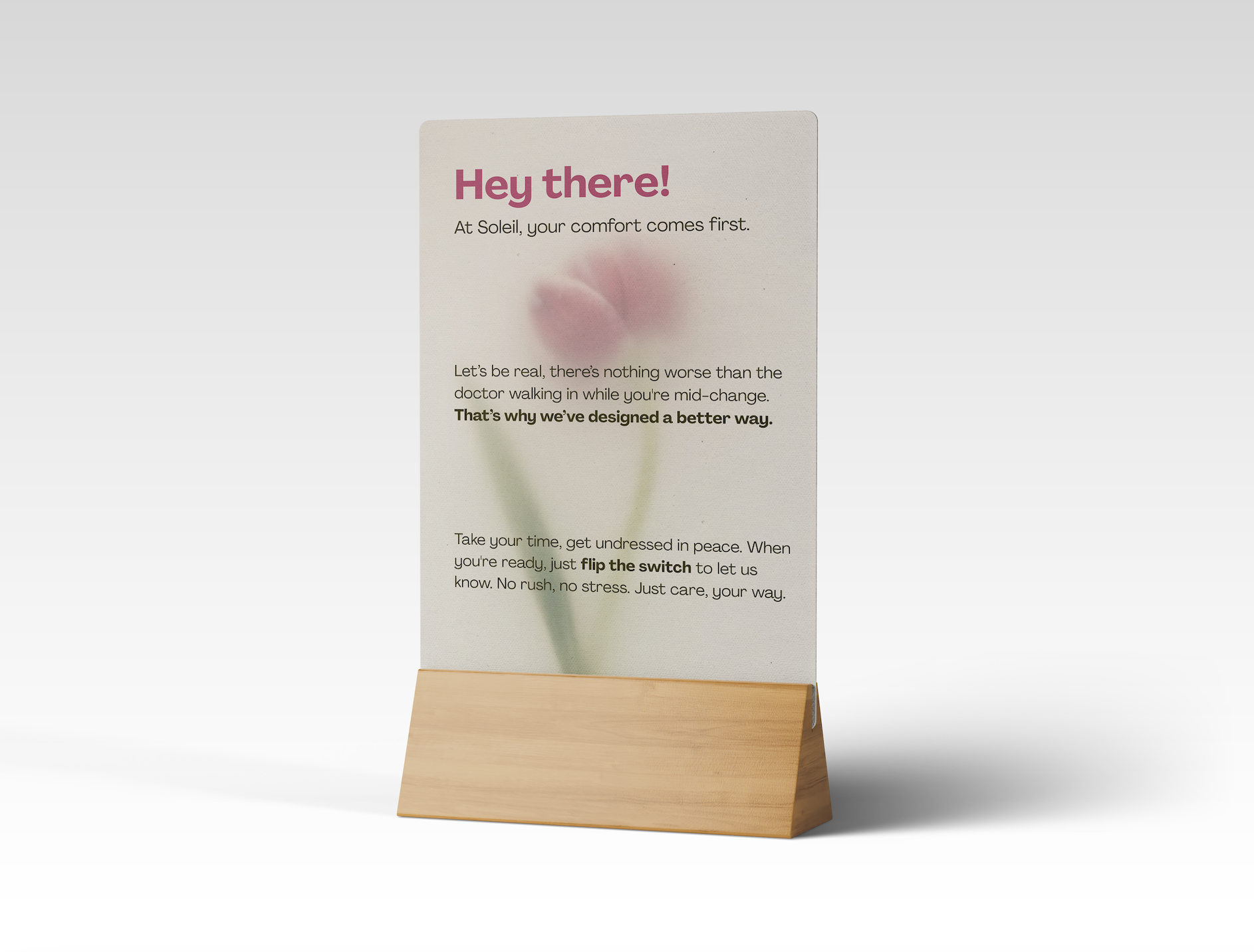
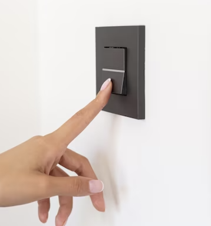
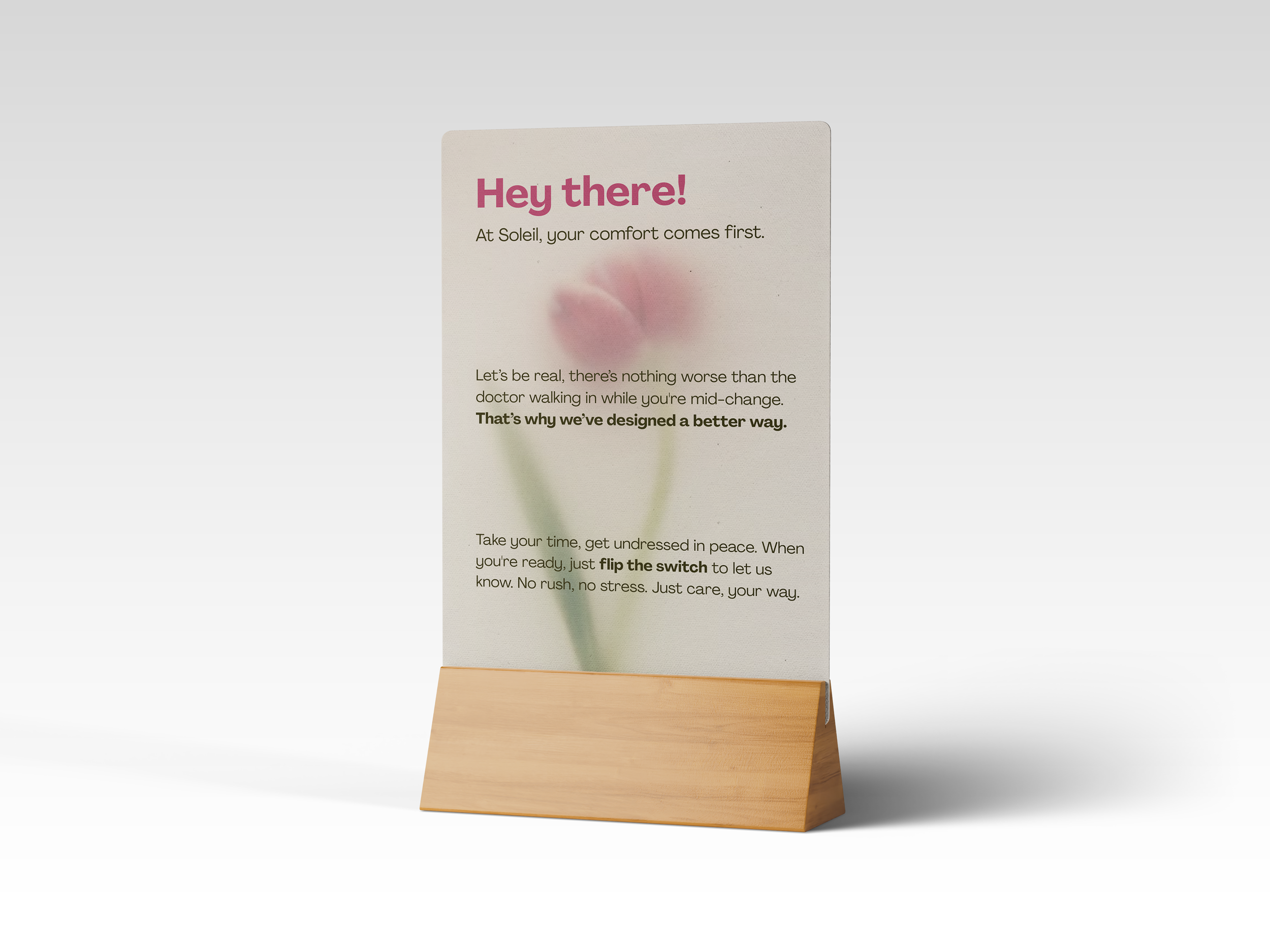
Created the Ready Switch.
I designed the Ready Switch after hearing countless stories from women about feeling rushed or exposed during their appointments, especially when a doctor or nurse walks in before they’re fully changed.
The Ready Switch is a small, discreet switch inside the exam room that the patient flips once they’re undressed and ready. It turns on a light outside the room to let the provider know the patient is prepared for the appointment to begin. Next to the robe inside the room is a small table with clear instructions on how to use the switch.


Saw a need for change with the exam chair.
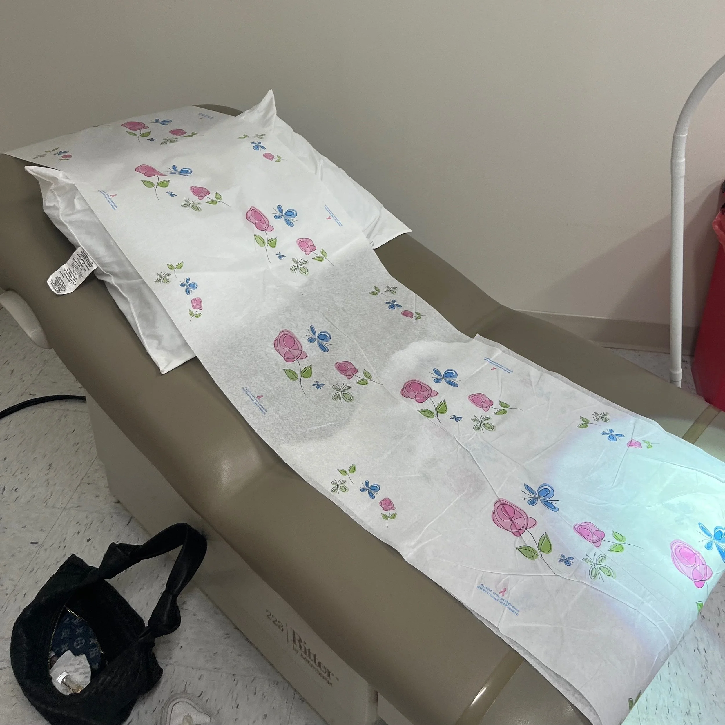
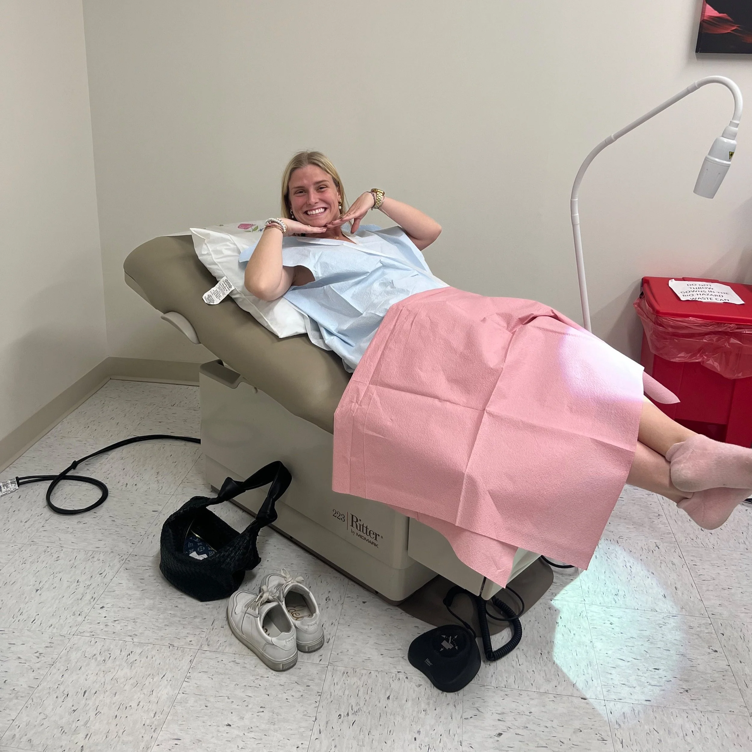
Another major area of concern was the exam chair itself. Women expressed frustration with the cold, crinkly paper cover, the discomfort of outdated stirrups, and the lack of control over how their body was positioned. I saw an opportunity to redesign the chair to feel more dignified. Replacing the paper with a self-cleaning material, rethinking the leg supports, giving patients control over positioning, and incorporating a sensory distraction element to ease anxiety during the exam.
Analyzed the current exam chair market.
I explored the current market for exam chairs to understand the materials, manufacturing methods, styles, color options, and pricing, giving me a strong foundation for designing something new.


Brainstormed how to go paperless.
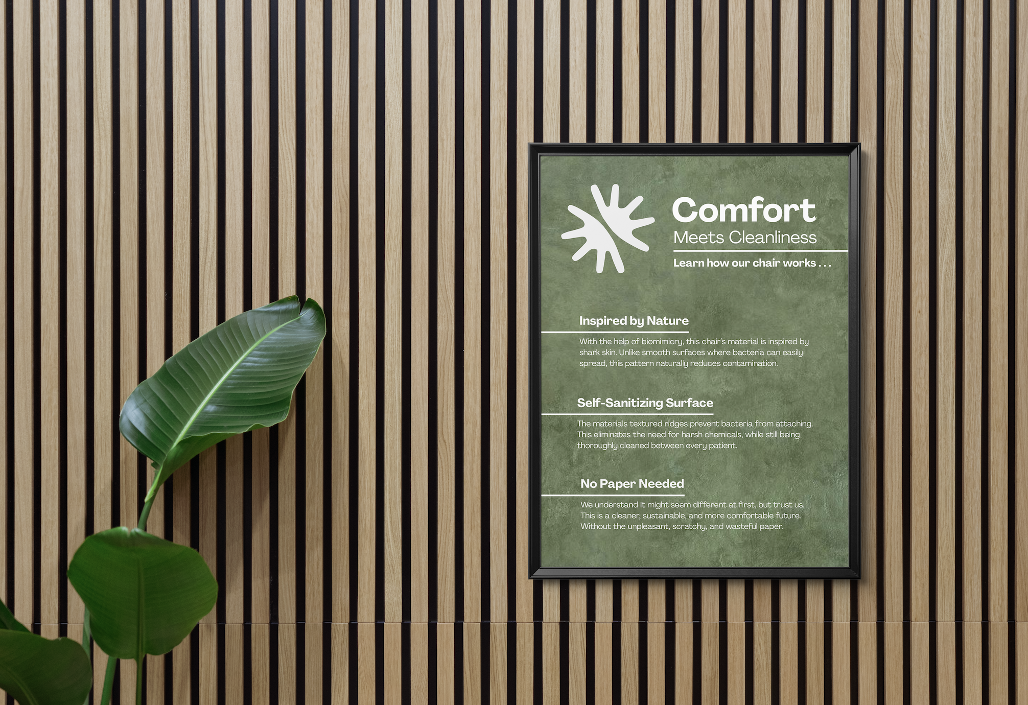
One of my main goals was to eliminate the crinkly paper sheet used on exam chairs. Not only is it wasteful, gynecology clinics can go through thousands of feet of paper a month, but it also adds to the discomfort. It feels overly clinical, it's noisy, and let’s be honest, sweaty skin sticking to paper is humiliating. I wanted something that looked and felt better and performed better. So I researched self-cleaning materials and biodesign innovations, including blue light sanitation. That’s when I discovered Sharklet technology, an antimicrobial surface inspired by shark skin.
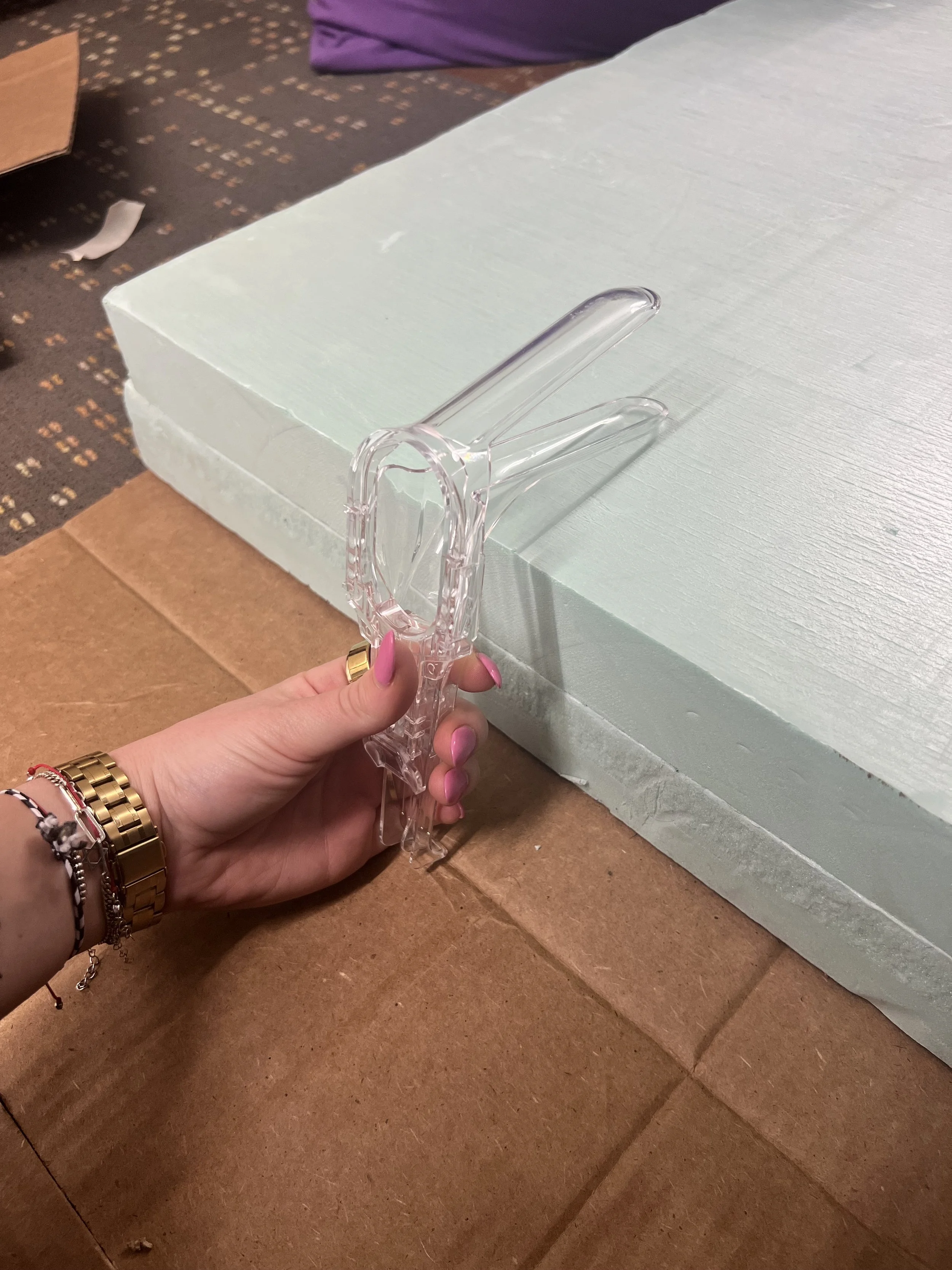
Discovered a better way to position the body.
Through research, I realized the traditional stirrups used in gynecological exams are not actually necessary. An article titled Empowering Gynecologic Exams: Speculum Care Without Stirrups by Feminist Midwife explained that elevating the legs does not improve access to the cervix or reproductive organs. The pelvis remains in the same position, so effective exams can be done simply by allowing the legs to widen. This inspired me to redesign the foot support to extend outward rather than upward, offering the same clinical functionality while improving comfort, dignity, and patient autonomy.

Brought my ideas into CAD software.
After prototyping and user testing, I brought my exam chair design into SolidWorks, where I explored multiple iterations before using KeyShot to create polished promotional renderings.
The Finished Product
Spatial Design
I redesigned the layouts of waiting and patient rooms, incorporating biophilic elements to foster a calming environment. I knew how important the physical space is, it sets the tone for the entire experience.
I created a framework for clinics to build from the ground up or adapt existing spaces to become “Soleil Certified,” a designation that signals a higher standard of care. Being Soleil Certified builds trust, so more women will feel confident scheduling their appointments, knowing they’ll receive thoughtful, empowering, and patient-centered care.
Experience Design
I knew that to make a real difference, I had to rethink the entire experience—it’s all about the patient and how they feel every step of the way. I focused on key touchpoints: the check-in process, the exam room environment, and the physical exam itself.
I designed a user interface for the clinic’s iPad system that allows patients to check in, share how they’re feeling, and communicate concerns with ease. I also created the Ready Switch—a small light system that gives patients control over when their exam begins, helping them feel more comfortable and respected during a typically rushed moment.
Industrial Design
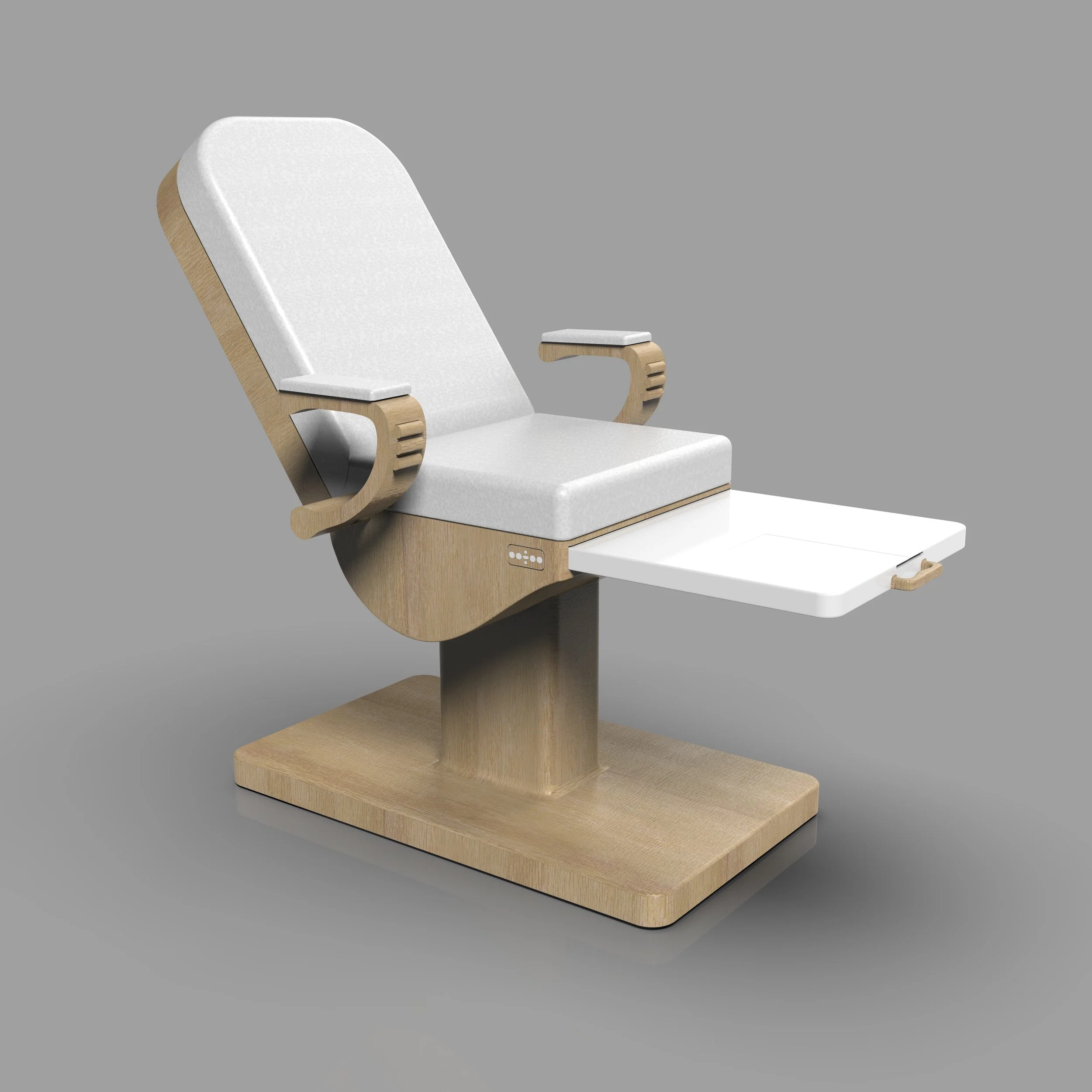
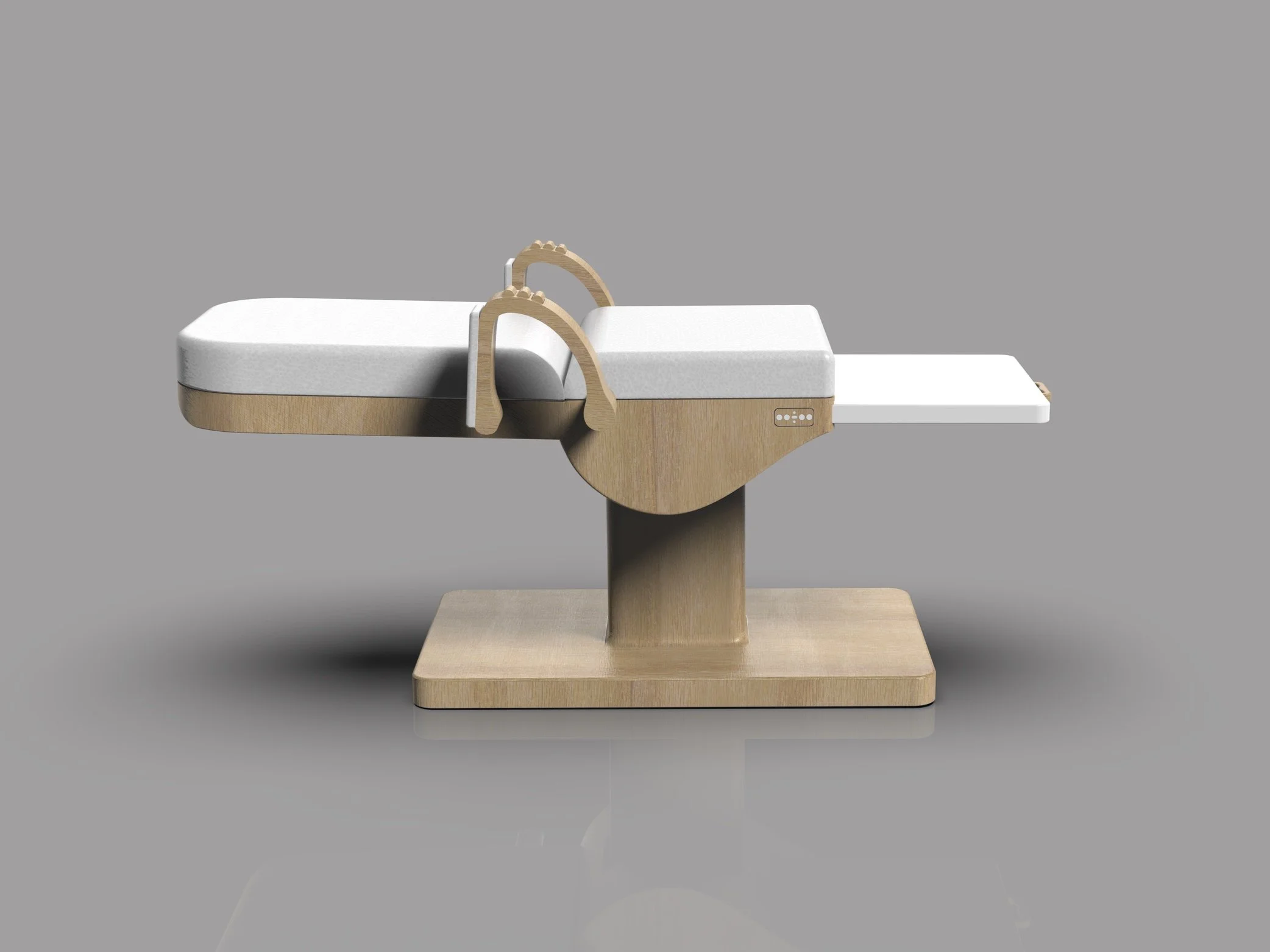
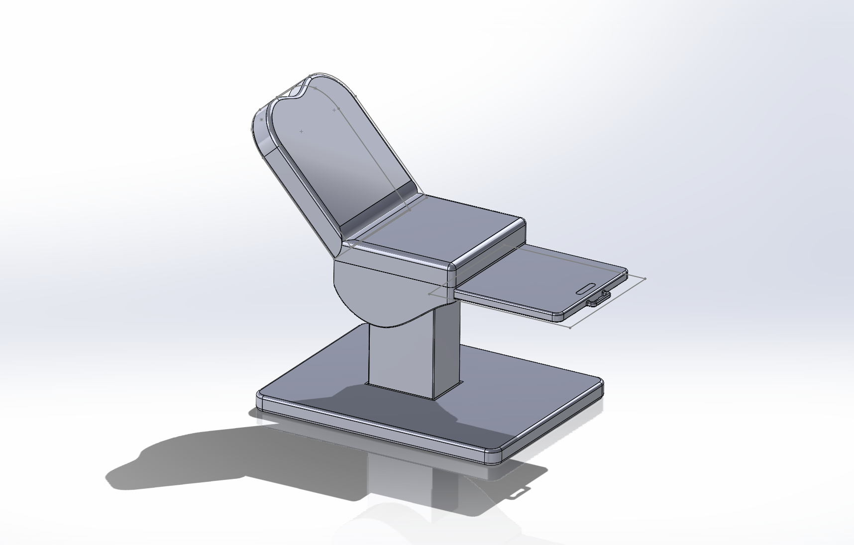
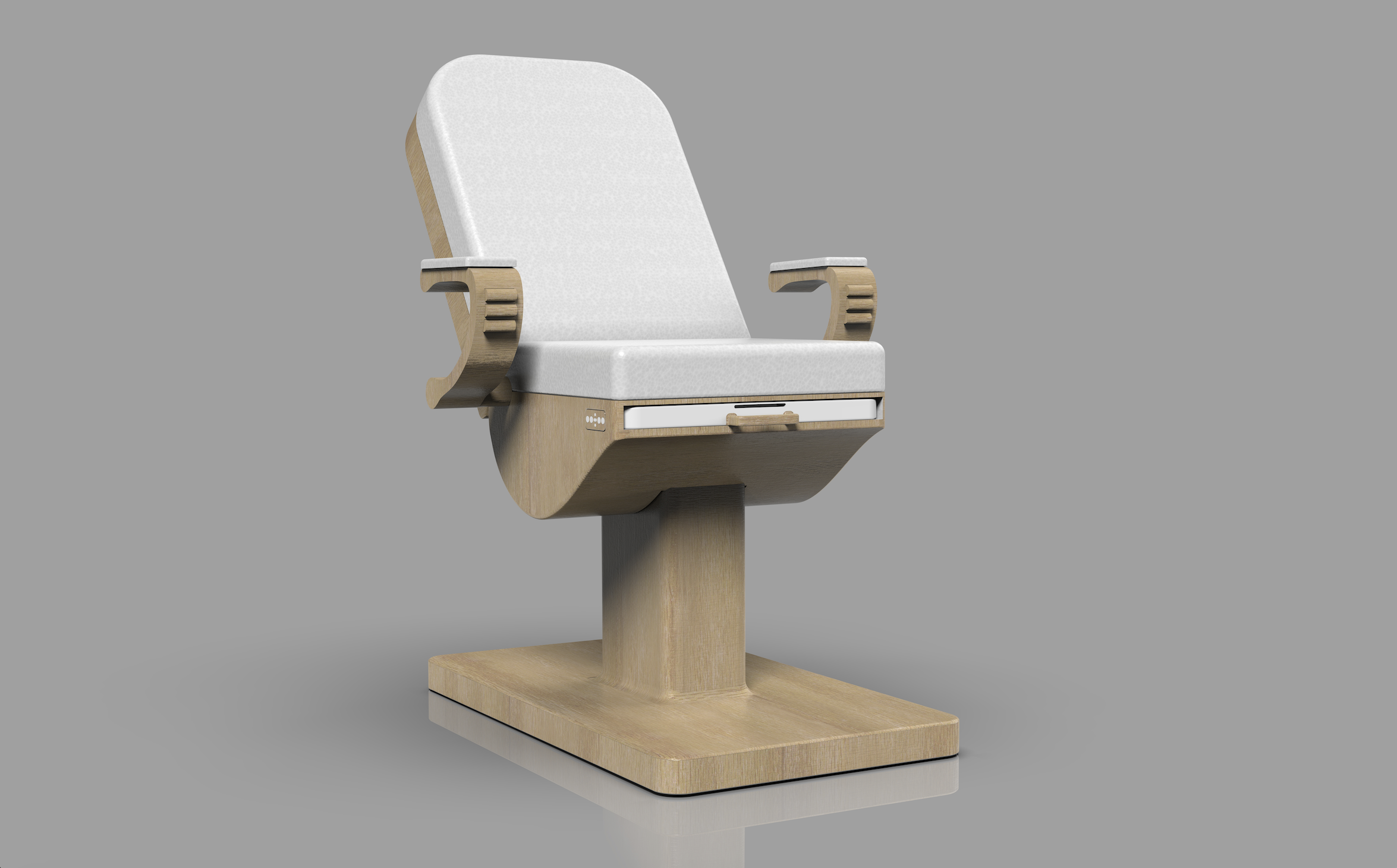
As a trained industrial designer, I know how much a physical product can shape experience. I designed The Vira, a modern exam chair focused on comfort, dignity, and patient control. It replaces cold, crinkly paper with a self-cleaning material inspired by shark skin. The stirrups were reimagined; moving away from elevation and instead simply extending the legs outward. I added a calming sensory feature in the armrest and gave patients control over the chair’s position to help them feel empowered in a vulnerable moment.
Soleil’s Check-In Interface
I designed a digital check-in interface using Figma, built to easily integrate into the iPad systems that many clinics already use. Patients can share how they’re feeling, communicate past trauma or concerns, and ask sensitive questions, all without the pressure of a face-to-face conversation. The interface also allows them to choose the music that plays during their exam and watch a preview video of what to expect, helping to ease nerves and reduce uncertainty from the very beginning.
This system was created to help patients feel more supported from the moment they walk in, while also giving providers helpful context before the appointment begins.


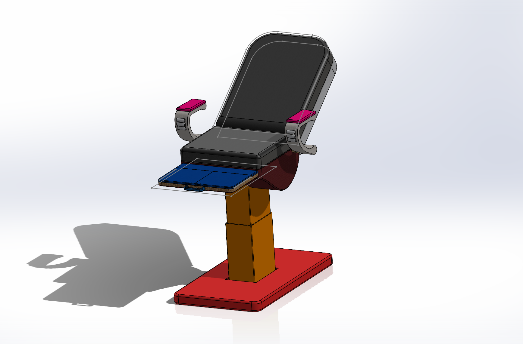
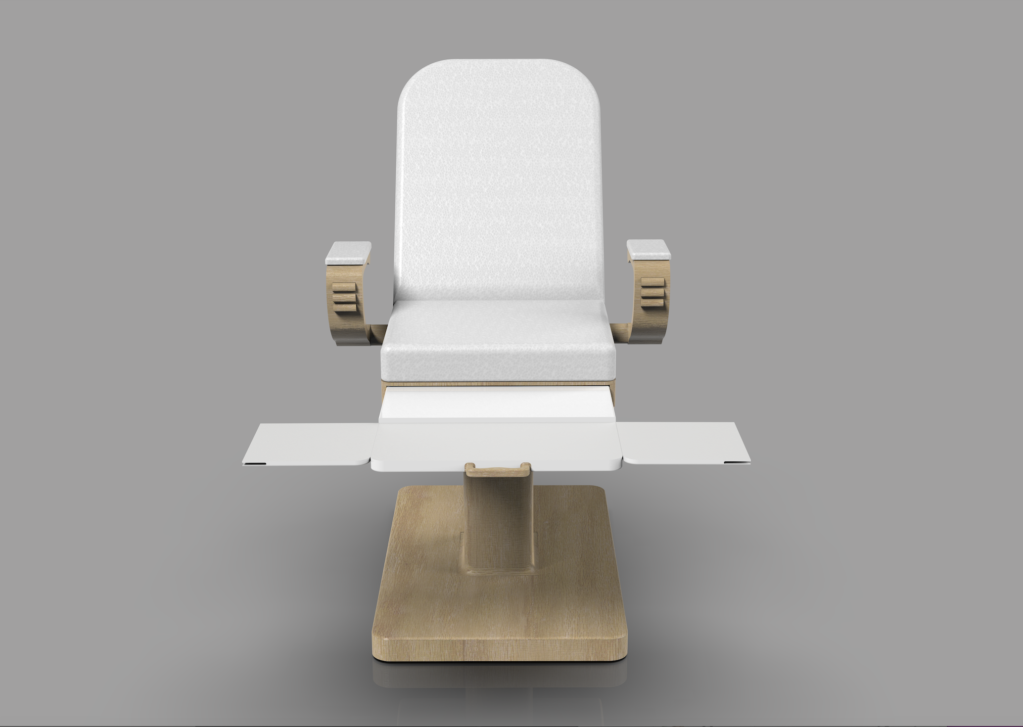
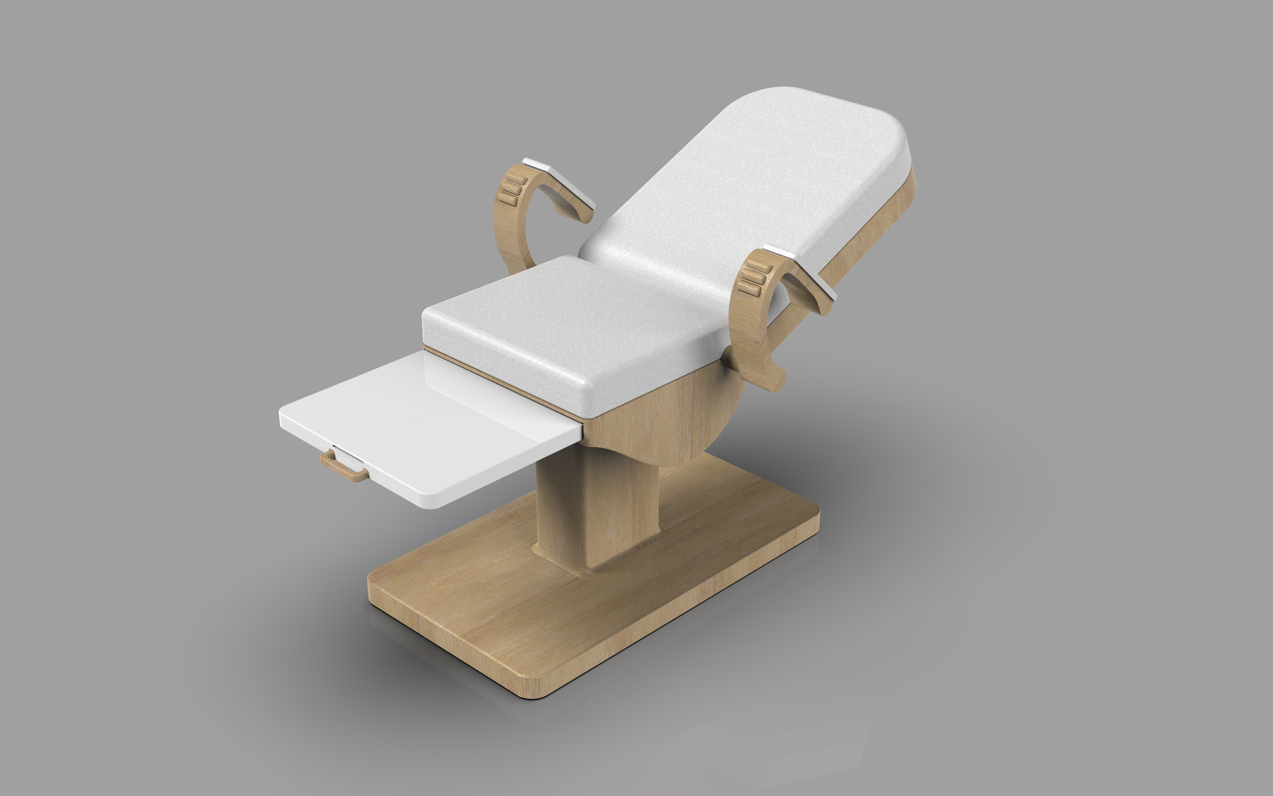
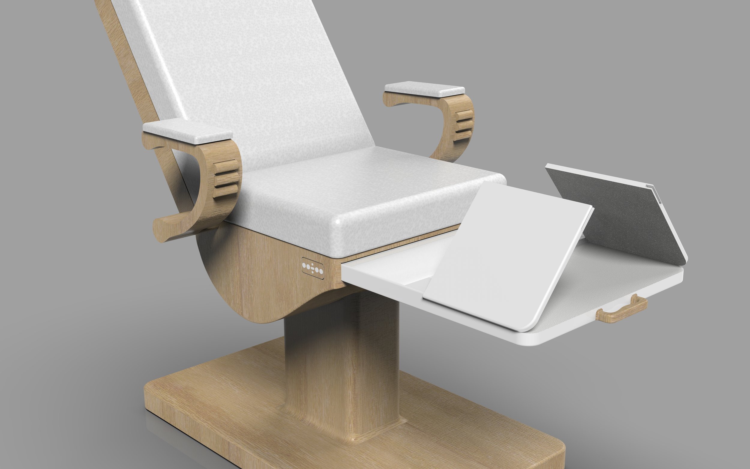
The Vira
I named the chair The Vira, meaning “brave,” to symbolize the courage and strength the patients feel while in the chair. The chair redesign was central to the project, focused on improving comfort, dignity, and patient autonomy. I removed the crinkly paper cover and replaced it with a self-cleaning, hygienic surface. The stirrups were reimagined to feel less clinical, and I integrated a subtle sensory element to reduce anxiety. Patients can adjust the chair’s position themselves with an intuitive panel, giving them more control. Made of stainless steel and wrapped in a warm wood composite, The Vira is designed to feel empowering, never intimidating.


How it works
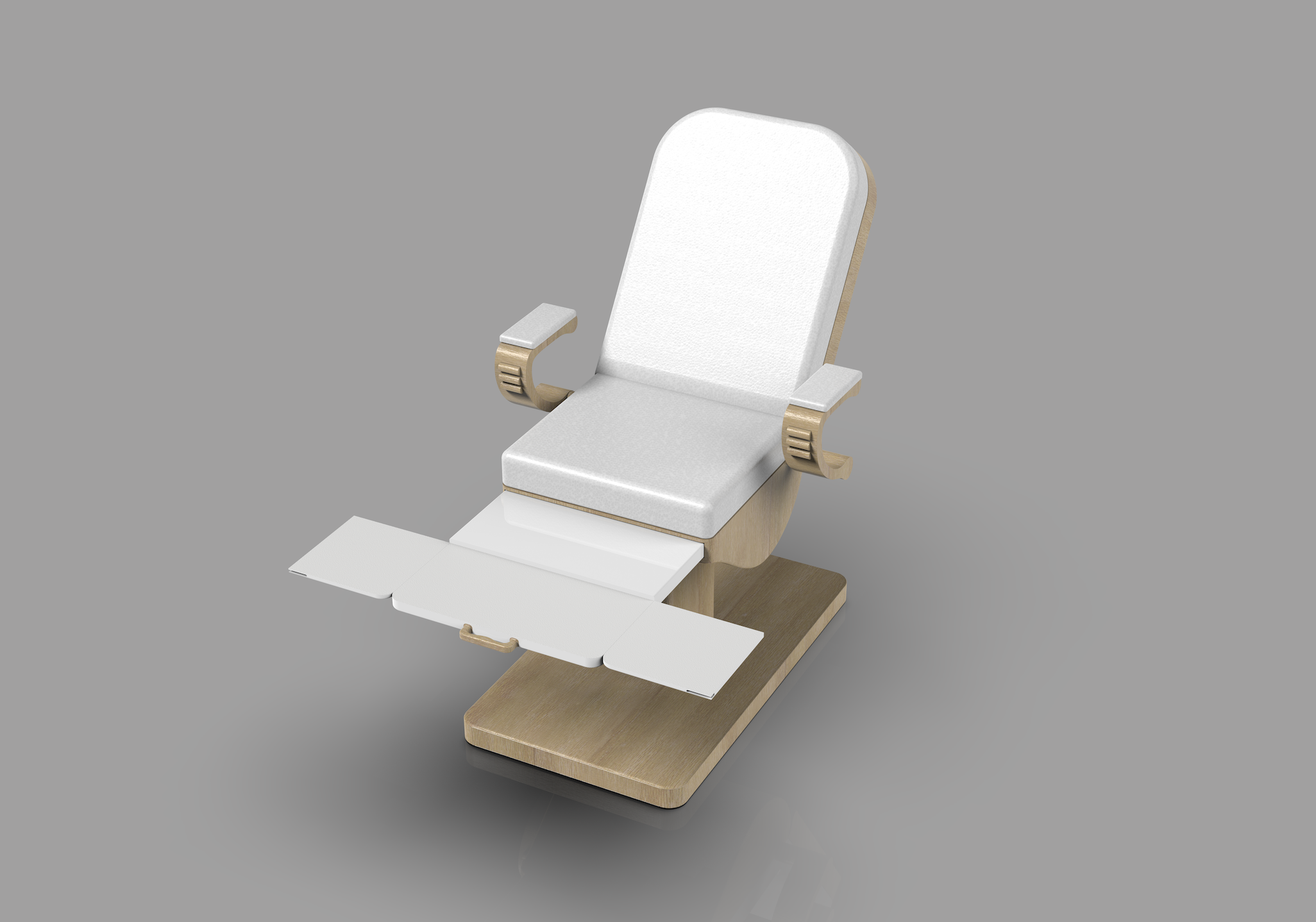
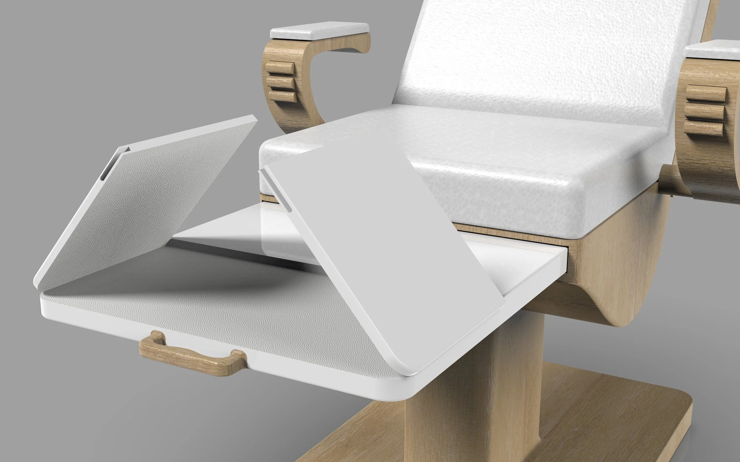
When the patient enters the room, they’re greeted by a chair that looks like a standard, stylish seat, not a medical device. This helps create a more natural environment for conversation with the doctor before the exam begins, allowing the patient to feel more at ease. The chair starts with the stirrups discreetly nestled into the base. When it’s time for the exam, the doctor uses a built-in handle to slide out the foot support, then easily pulls and folds out the leg extenders. The entire transformation is simple and seamless, maintaining both comfort and dignity for the patient.


A new approach to stirrups
Instead of traditional elevated stirrups, The Vira features simple leg extenders that unfold to create a wider, more natural foot support. Research shows it’s not elevation that's necessary, but the separation of the legs. This design is easier on the body and feels far more dignified. The footrests are covered in a non-stick, grippy material so that the feet do not slide. This gives the doctor proper access while keeping the patient grounded and in control.


Increasing autonomy, comfort & control

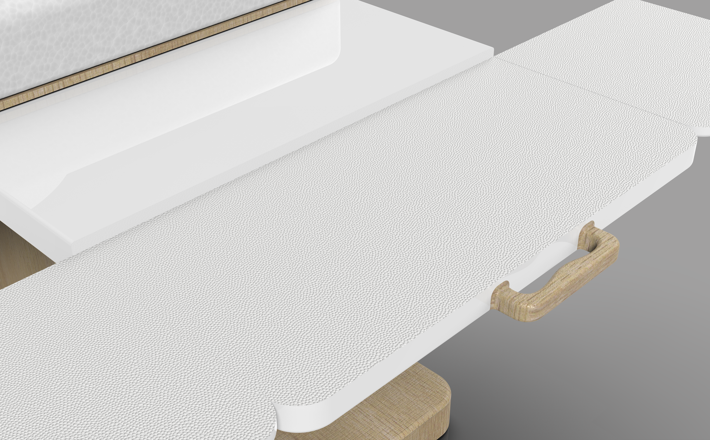
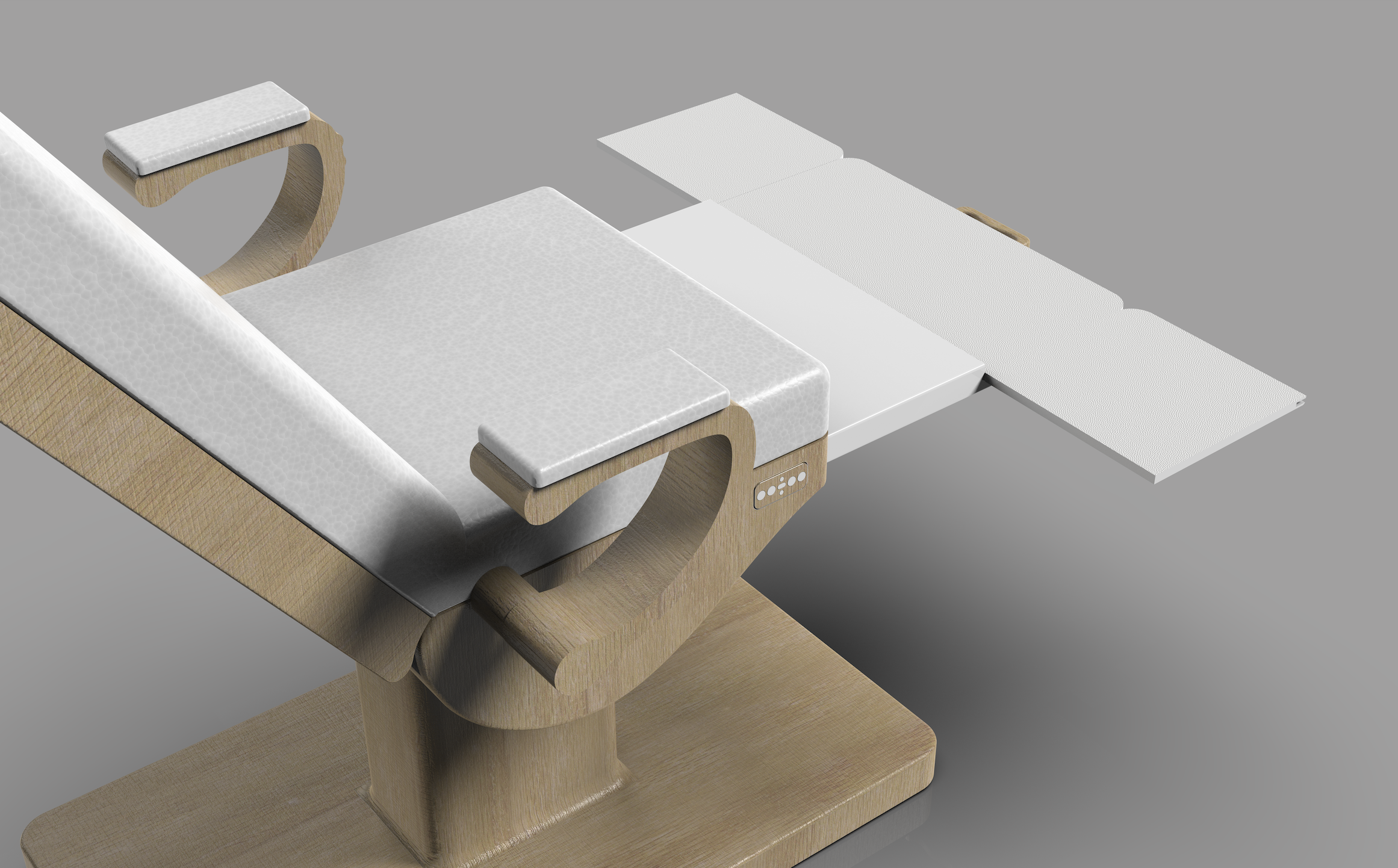
The Vira’s self cleaning material

The Vira uses bio-inspired material in place of paper. The interlocking diamond texture, modeled after the microscopic pattern of shark skin, naturally prevents bacteria from sticking to the surface. It’s sleek, soft, and hygienic. While the material resists microbial growth, the chair is still thoroughly wiped down and sanitized between each patient. I took into consideration how some people may be skeptical about the cleanliness of the chair without the paper cover. To ease everyone's mind, I created an informational poster that describes how the material works.


Arm rests with benefits
The Vira’s armrest features a built-in sensory element designed to support patients who feel anxious or need a calming distraction, perfect for someone who twirls their hair when nervous or fidgets during class. Three smooth rollers are embedded into the side of the armrest, allowing the forearm to rest comfortably while the hand naturally reaches down to engage with them. After testing different fidget concepts, I landed on this design because it’s satisfying and distracting in just the right way, enough to ease tension without overwhelming the moment.


With a sleek, non-intimidating look, The Vira blends into the room like a modern, chic lounge chair rather than a medical device. Using a simple button panel, patients can adjust the chair’s height and tilt, moving it up, down, backward, or forward to find a position that feels right for them. This small shift in control helps reduce anxiety and creates a more empowering, comfortable experience.


Thesis Book
One of my favorite parts of this journey was creating my thesis book. I’ve always loved bringing my designs to life, but I believe that making a product is only half the story. The ability to clearly communicate an idea, whether to a consumer, an audience, or even a family member, is just as important. Designing this book allowed me to merge my love for storytelling, graphic design, and brand development. It captures the full process, from research and ideation to prototyping and final concept.


Social Media Campaign
One of my biggest takeaways from this project was realizing just how powerful branding can be. I created an Instagram account for Soleil to help build its presence and connect with patients. The platform offers a glimpse into the clinic, helping attract new visitors while nurturing a sense of community among existing patients. It also serves as a space to educate and empower people about the importance and benefits of gynecological care.


For more information, check out my thesis presentation below.